Showing posts with label OUIL404 Visual Language. Show all posts

Saturday, 21 March 2015

OUIL404 Visual Language End of Module Self Evaluation


Leeds College of Art
BA (Hons) ILLUSTRATION
Level
04
OUIL404 Visual Language
Credits
20
End of Module Self Evaluation

NAME
Sam Metcalf


1.  Which practical skills and methodologies have you developed within this module and how effectively do you think you are employing them within your own practice?

I have found the compassion task in this unit have been vey effective in making want to apply it to my own practise. As it has made me not only think how my work is built up and looks but how other illustrator and artist work is done, its made me see art differently.


2. Which principles/ theories of image making have you found most valuable during this module and how effectively do you think you are employing these within your own practice?

Planning my work before hand and doing roughs/scamps to help with the first stages of compassion. By drawing basic shapes of the elements of the image I’m about to make helps with a few different versions of the different layouts the objects could be in. Also it helps to apply colour to these roughs to see if the colours are going to work together and the balance of each colour is ok, its better to find the mistakes of these early steps before iv put a lot of time and effort into creating a finished piece.


3. What strengths can you identify within your Visual Language submission you capitalise on these?

Mainly the importance of planning out what I’m going to construct and working out how the final image is going to look before starting on the final image, Trying different features in different places rearranging and trying things I don’t think are going to work in roughs to really see if they do or don’t work. Not using as much detail as I feel is need basic shapes can be enough to see how something is going to look without putting hours in to find out it doesn’t work.

4. What areas for development can you identify within your Visual Language submission and how will you address these in the future?

The early stages of this unit like the shapes, textures and tones tasks. I feel it took me a while to really understand what this unit was all about and in the early stages it did not have my full attention as I dint understand why we were doing these kind of tasks. But as the unit got to the other subjects like line of sight and depth I started to understand what it was trying to teach us. It was whilst doing one of the later tasks I could see why having a better understanding of how textures could of improved what I was working on. 

5. In what way has this module informed how you deconstruct and analyse artwork (whether your own or that of contemporary practitioners)?

Understanding how they where constructed and the different rules of compassion have helped me understand why images and done like they are.


6.How would you grade yourself on the following areas:
(please indicate using an ‘x’) 

5= excellent, 4 = very good, 3 = good, 2 = average, 1 = poor

1
2
3
4
5
Attendance


x

Punctuality


x
Motivation


x


Commitment


x


Quantity of work produced


x


Quality of work produced


x


Contribution to the group


x


The evaluation of your work is an important part of the assessment criteria and represents a percentage of the overall grade. It is essential that you give yourself enough time to complete your written evaluation fully and with appropriate depth and level of self-reflection. If you have any questions relating to the self-evaluation process speak to a member of staff as soon as possible.

Friday, 20 March 2015

Screen printing

The task was to produce a 2 colour screen print A4 in size. I set about thinking how  could best get a image to best demonstrates my understanding of composition in a 2 colour screenprint. The first thing I knew I had to do was keep it relatively simple.

I tryed to rough out a few ideas by they were not interesting but it got the layout ideas rolling.
First 3 to get things started I just drew anything that popped into my head


I love skulls so thought how could i get one into this screenprint

Passed a graveyard whilst out walking my dog and it clicked that the graveyard along with the church would work fine. 

Tried the a skelington a few times prying in the graveyard but this was too much detail. 


 Went to the graveyard and took a few photos. This is St Oswells church in Guiseley, i took loads of photos, these three demonstrate what i was try to do with the composition.


Too much going on in the background


Seeing if a big skull as if it was stood very close to the viewer would work, i feel it was too much and it needed a face to humanize it. 
Too low down off the page just looks like it was planned out wrong. 
Here I realised that if the skull was looking up to the church it would be looking left to right the way we read a book so the best way to read a image. 


Final Image screen printed, the brightness of the pink is very off on this picture. Very happy indeed with this final product probably the happiest i've ever been with anything i've produced.  


Wednesday, 18 March 2015

Line of sight

Using the rule of sight, we developed images to try lead your eye through a image by adding elements that guided your eye through the image. I choose to use a train station setting as I seem to spend a bit of time at them these days. I noticed that they have some of the key elements for creating a line of sight image and getting you to follow a image to the point i want to lead you too.

Things I looked at that could be used to compose the image

  • Roof
  • Signs 
  • bench
  • flower beds
  • colour 
  • fence
  • street lights 
  • person

    Trying different ideas and modes of transport to see which would be best suited for this task. 
    Railway tracks started to seem like a nice ideas and i have a few photos i have taken that would be nice t use as a reference. But I quickly realised this images had a lot of detail and i was finding it hard to translate this to paper. 

    Then on my journey home I realised that a train window creates a nice frame and captures a scene nicely. 

    Adding people to the image could of helped direct your eye to a point if the detail was added to the eyes of the commuters, but i felt that adding people was too much for the compassion and distracted you from the landscape outside. 

    The train station held the elements i was looking for to compose the image. By doing roughs i was able to play around with the layout of the image and construct it in a way that would use  line of sight to guild you through the image. 

Elephunk, Me and a butterfly.

We were given the task to compose an image that included a elephant,  a butterfly and a person maybe me. I was trying to show the depth of the compassion using these three elements. So in order to do this i needed to think about scale and how the size of each thing would look in relation to each other. This was difficult due to  firstly it was done in a short amount of time and secondly I have never really challenged how images are composed and used the rules you need to apply to get this to work. So in essence i was scared by such a little task but once i had completed it the penny dropped that i needed to up my game and stop avoiding the principles of making a successful image and get on board and learn them and put them to practise.

Drawing ink and a brush was used,

I feel this was a success in ways but not really in doing what it was went to. The scale of each element is off and the elephant looks all out of proportion, and I have grow a few feet (wishful thinking) and as for the "butt"erfly its bigger then my head. I tried to add some shadow to create some kind of depth, which worked a little but was let down by the rest of the image. But it has made me want to learn about compassion and how to create a well composed image.

Saturday, 14 March 2015

3 Man composition scene

Here we had to create a scene that had 3 people in it. One in the foreground, one in the mid ground and one in the background. I tried to keep it as simple as I could and not have it over complicated. so i choose to have two of them stood facing the third person. i tried to make it like a scene from in a shop with two customers looking at the cashier. I tried to illustrate this by having them both facing the same area of the shop and using they eyes to try direct you to where they are looking. I feel very happy with this exercise as I feel the penny has dropped with how composition works and how important it can be in making images, giving them flow and have areas of interest.
Also using pencil crayons to add colour, as before i always shyed away from using them but with doing roughs and scamps and using them to add colour has shown me they are a great way to get ideas and colour schemes down on paper and help compose a image.


Here are some of the roughs I did when trying to work out the compassion. I feel from this task and these roughs I have done it clicked the importance in doing roughs and the benefit of doing them. I realised that it saves time and effort when starting out on a image and can help to arrange and compose.


Different sense to see if i could get a nice composition to work with.  

Tried to angle the checkout but could not get the perspective right

Bringing the face righ tto the front of the image worked as it made that character feel very close. 


Coloured with pencil crayons very quickly but i feel they give some nice tonal qualities and if done with time  could help give some more depth to the image with added shades and tones.  

Wednesday, 11 February 2015

Composition task


Here i have tried out some different composition lay outs to see if the changing arrangements of the different elements makes the image look different. 
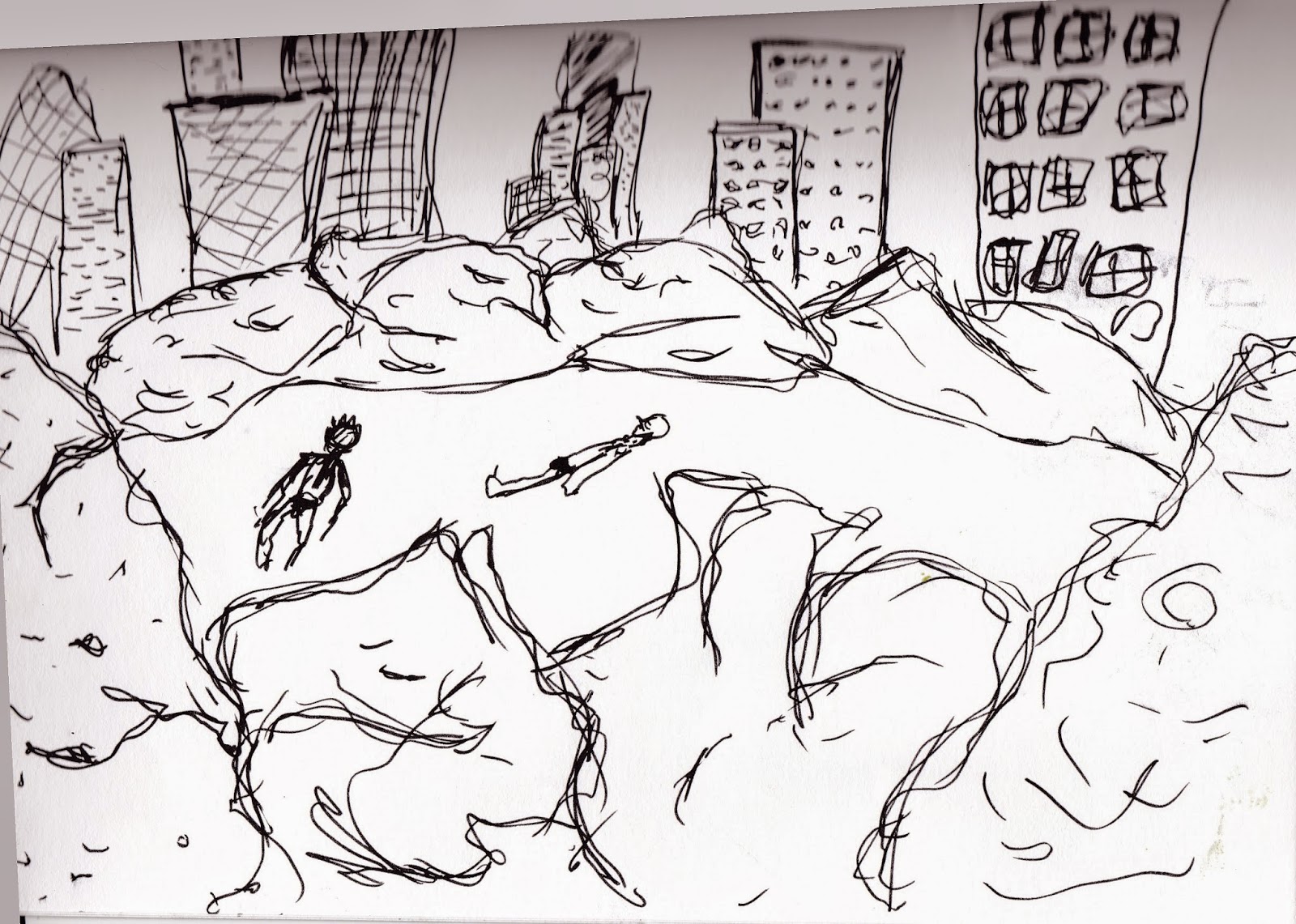
  • Using just 3 elements Sunbather, A City sky line and Bushes. 


  • Too much space between object and the sunbather looks like he is floating in mid air. 


  •  Sunbather and Buildings too big. 
  • Make the the buildings smaller so they appear in the distance and are part of the background. 
  • Sunbather needs sorting


  •  Really like the skyline on this it looks like its in the background and still holds its grand scale it would be. 
  • Sunbather happy but needs a purpose, happy will not cut it. 

  • Tried to add more bushes to give more of a city park feel but it just takes over the image.
  • Skyline extended off the page does not work at all 


  • Only the sunbather lets this one down needs to be scaled down and put in a better place.
  •  i feel the balance is getting there with the bushes and skyline
  • The space around the buildings works well 

Saturday, 3 January 2015

Mutation of me

Slash and I

I went to my friends 40th birthday party and the theme was a famous person with the same first letter starting name. So i went as the legend SLASH as hes just an amazing musician and im a fan of his music. 

Here i am dressed up as him and on the right im with my god Hermes thats how Slash rolls he dates gods not humans. 

\\


Here i have  drawn the portrait of the image above in pencil, I h ave never done a "self" portrait before and i found it very difficult. I feel I need more practice at drawing portraits to better understand how to draw the dimensions of the face getting the spaces between the different features right and spaced equally.

Tuesday, 9 December 2014

College Poster


We were asked to produce a poster made from college. I had a go with cutting out of newspapers and magazines but i found that I was very limited in what i could create as to what was on had to use for the images.  So I thought it was time I learnt more about using Adobe Photoshop as I still only have a basic understanding of how the program works. So I set about producing a few ideas and for some reason my hatred of the Conservative party started taken over and spilling out on to the page, but i feel this happened as the newspapers are full of they propaganda as most of their rich friends own the papers but that's a rant for another day. So i took a step back reassessed and set out to produce a college style poster for a northern soul night. 

At the time i was thinking about ideas for this poster i was watching one of my favorite films KES and from that i thought using a northern accent in my poster would do for the northern part of northern soul. Then the soul part had to be the soul of a wellington boot as in the north we all wear wellies because we are all farmers. But i found they need some sort of face so people could relate to them so i just search and found nice teeth images and some googly eyes and of course the Flat cap whats more northern then the flat cap, and bam a northern soul.


When doing this again instead of using images found on search engines I will try and create my own images to be used like taking photos of boot souls or scanning them in, the same for all the bits of the poster, maybe even doing the speech an bubbles by hand and scanning them in or using a graphics tablet. The background i feel lets this poster down as i could have a countryside image there or some more interesting then just yellow.

Thursday, 27 November 2014

Shape


We where looking at shape and how simple shapes could create images and illustrations. As with the last task I again struggled to start with on this one but once I started to play around with ideas I feel I produced some ok images.


To start off with I used paint pens to produce the logo fist that is know as the "keep the faith"logo of the northern soul scene. As this logo is a simple design I just changed the fingers to rectangles and for the wrist and arm i used a triangle and square to replicate this.


When you draw figures you start out by drawing the basic shapes of each body part using cylinders and circles. So i thought maybe this could be used in this task. I dosed work i just need to move it forward to maybe collage and see if it still works and or improves it.


A bit of word play with northern written on the soul


People seemed to collect wigan casino badges  and sow them on to adidas bags.
The logo that has and still is used is made up of three different sized circles.


USing coloured paper i created these images by cutting out the desired shapes and sticking them together like a colarge. This proces i feel worked best as the results looked better then my previous efforts.