Showing posts with label OUIL503. Show all posts
Showing posts with label OUIL503. Show all posts
Wednesday, 13 April 2016
OUIL505 End of Module Self Evaluation
OUIL505 End of Module Self Evaluation
So when we were first briefed on this unit I was not looking forward to it at all. Having to show my work to other people and put it up on web sites and have it on display for other creative people to see, sounded like it was going to be right barrel of laughs and something I was not use to at all. The idea of having to take part in competitions and work as part of a team. This did not last long as I really started to enjoy this module and having to do all these things has helped my confidence in my work massively. Even though I have not won anything I have entered this has not deterred me to not do this kind of thing again, in fact its had the opposite effect and made me want to improve to better my chances at been considered. This is something I diffidently did not consider at the start of all this unit and is a welcome surprise.
Once again I can say one of the major things to let me down was my time management but it has improved but I’m just not right good at sitting down for long periods of time with out getting distracted and wasting time. This is something I am working o but could be improved to help me get more out of my days.
With working on so many briefs at once this has benefited me in trying and using new methods mainly with my nice new isograph pens. It is my favourite way of work and I know I should try new methods and technique but I have made a great effort to improve my ability’s with a drawing pen, if I’m going to stick to this method I need to start to master it and raining it in. By drawing quickly I have started to look at my line quality and the thicknesses that can be used to create simple contrast and give movement and effect.
With my much slower dot work I have started to use the different size pens from 0.05 to 0.8 to create texture and different qualities to the work.
As I have talked about a lot in my blog and boards I have got to a stage with Photoshop where it is coming into use with me creating work a lot more. This is down to me developing my work with trial and error and in doing so picking up how the program works.
One of the hardest tasks was working with others on a project. It made it clear I need to ask more questions at meetings and don’t be afraid to communicate with people until its too late and communication breaks down. I feel I had a amazing group to work with but I feel all party’s could of made the final project better if we had made it a priority to organize and communicate much better. I feel towards the end I took to much of a step back and let the side down as it was a last minute finish and I could not attend due to work commitments. This could have been avoided if I had communicated earlier to avoid the mad dash we had to finish the project to be submitted or just quit my job but that’s not a realistic option.
One of the latest issues I’m having is with that god forsaken site called issuu, every time I use it does it come up with a new issue, but again with the demanded use of it for the hand it I have come to understand how to use it better but still a few issues, I’m sure with time and more forced labour on it I will warm to it.
Overall I am very happy with the way this module has gone I have learnt valuable lessons and I’m keen to continue to work in this way to develop and make work. I feel I will continue to take part in competitions and push my self to get on work out there and rt improve with each piece done.
Monday, 28 March 2016
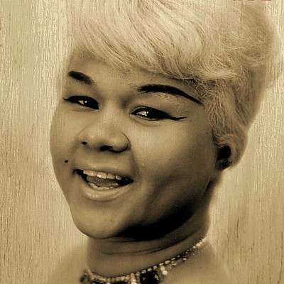
Secret 7- Etta James, At Last.

THE RULES
1. Your design must not include the artist’s name or
the song title
2. Concentrate your design on what will be the front,
only this will be visible in the exhibition
3. Dimensions should be 184mm x 184mm, with a 3mm
bleed all the way around. That’s 190mm x 190mm
in total. The bleed won’t be visible, so bear that
in mind
4. Your file must be produced in CMYK so it’s set-up
to be printed. Any PMS specials will be converted.
Metallic or fluorescent inks cannot be reproduced
5. Your file must be 300dpi
6. Your file must be saved as either a Tiff,
JPEG or PDF
7. Do try and reduce the size of your file as much
as possible - 10 MB maximum
8. You can submit a sleeve design for as many of our
tracks as you like, and more than one for each track
9. You must have until 23:59 GMT on 2 March 2016 to
upload your designs. Late submission will not be
accepted. We advise that you don’t wait till the last
few minutes to upload, as the site will be busy
10. Last but certainly not least - if we email you
with the good news that you’ve made it into the show
please keep it a secret. It makes for a much better
project!
We ask for all your details when you submit
a design so that we can shout about all our designers
once our sale day has passed and the secrets are out.
Note: design inspiration to be 140 characters
(including spaces) or less. MS Word count does not
include spaces so twitter is the best way to check
this. Avoid unusual characters. And remember, your
artwork is priority. Keep the description simple.
My submission is going to be for Etta James - At Last. I choose this song as it reminded me of something to do with spring and how it feels when the weather is changing. So i decided i wanted to do a landscape scene where the first glimpses of the sun would be poking through burnning away the winter gloom and doom.
I take a lot of landscape related photos so i decided to pick out some of sunrises and sunsets ones to see if i could get some with good vibrant colour. Im going to try not spend too much time on this design as i have had in my head what im going to do since i first heard AT LAST. I think i might even drag my watercolour paints out to colour this one.


Here I have drawn out the outline to my landscape image I have used marks to mark out the hills, sun and clouds as I feel this will look better on the final image and not just a plain old black line.

Here I have taken my outlines and using watercolors I have added the color. I did this in a fairly fast time as I am known to spend ages messing around applying the paint and resulting in a messy finish, so here I have done it quickly and tried to use the direction of my bush to define what direction the landscape is going in. Im happy with the outcome and glad i did not spent too long trying to get a perfect finish to the colour.

So once the paint dried i scanned it into Photoshop and they i played around with the levels, brightness/contrast and hue/saturation to see if i could get a feel of depth and the warmth of the summer sun in the image.
I was happy with certain elements of the final image the marks on the right hand side hill is my favorite bit as it gives over the directional flow of the landscape. And after along time of staring i was happy to submit the design. Then once i had submitted it to the contest i was not happy with how the sky looked as I feel the colours are now too much and could do with toning them down.
The sight of that first summer sun finally getting here
melting away the gloom of winter, this song is all about that.
My artwork did not make it to the show here is the email i have received to inform me.
|
Friday, 18 March 2016
Illustration Friday Dragon
This week's word is Dragon so its a beast breast breathing fire. Done using watercolour and photoshop and a tiny bit of pencil.
Was painted along the width of A3 scanned in and stitched back together, Cropped down and resized around a5.
Did the image in watercolour in no time it took longer to dry then it did to paint, as i did not want to start trying to add loads of detail and taking ages on it. I would of liked to but i dont have the time, but saying this im happy with the results, the only thing i might want to change is the amount of red thats come through playing with these settings in photoshop.
{UPLOAD ORIGINAL SCAN}

Thursday, 18 February 2016
Illustration Friday HAT
HAT
Here the word hat was given as this week's word and the ideas were endless, but I was coming up with ideas for another brief when I drew a sea bird on its way to work with its morning coffee on its beak. And would you know it he ended up wearing a red hat so that was this weeks done without even knowing it. So once I had decided to use the drawing i did the usual and scanned it in to Photoshop where the levels were changed and colour was added. I again added noise to the sea as it gave the effect that it was full of sea looking colours. Then adding a gradient fill to the sky to try get the image to appear to be set at sunrise as they do say the early bird catches the worm haha the bird is a worm farmer from here on out.
So this weeks word is done using a sea bird and coffee.
 |
| This has the hat and abit of the beak already coloured asi did this with a pen before scanning it in. |

Sunday, 14 February 2016
Group Brief WWF
Isla and Joal From BA graphics.


We have chosen to do the brief for the WWF.
http://www.wwf.org.uk/ - WWF official web site.
http://www.dandad.org/en/new-blood-wwf-brief/ - the breief from DandDA web site.
So we have had a few meeting to decide how we could best tackle this brief. IN the end we have decided we are going to try and design a series of coffee cups with animal characters. This will also be done with the use of a hash tag linked to each character and the customer will have to show they loyalty with they chosen animal. When they share they purchase on line and use the correct hash tag they will be rewarded with a points scheme. Also we need to come up with a welcome pack for members and information about the scheme and how it works.
Things that need to be drawn.
Designs for coffee cup,
Welcome/information pack,
Text lettering (make it stand out.
A selection of different designs on coffee cups.
ANIMALS FROM WWF WEBSITE WE DECIDED TO USE ON OUR CUP DESIGNS.
Sloth - Saul
Turtle - Taylor
Penguin - Pam
Whale - Wonder
Samlon - Sam
Rhino - rafieci ??? (look up spelling on name)
We gave the animals names so that is the name you hash tag, this gives it a more friendly edge.
We are going to work with the hash tag #wakeup then the animals name. This works both for a morning coffee and waking up and also to wake up to the fact that these animals need our attention and help to survive excitation .
Whales
I need to come up with a drawing for a whale so looked up which whale is endangered it turns out theur are quite a few.
Endangered big fish
Whales
I need to come up with a drawing for a whale so looked up which whale is endangered it turns out theur are quite a few.
Endangered big fish
| |||||||||||||||||||||||||||||||||||||||||
So i started to draw up some whale designs to be out on our coffee cups. Using images for google i looked up which whale would make a intreasting image. So first is the bowhead whale, I chose to use this whale as it looks like it has a sad i need coffee face. Also i drew a fish based around a common carp but this is just to get my head into drawing fish, as i have drawn a few fish iv caught and feel comfortable drawing them and Humphead Wrasse are not too different shape, as next up is a Humphead Wrasse.   If i can recreated these effects on to my Humphead Wrasse illustration i'm going to now draw i feel the results could be more interesting then it i just use flat colour. A few attempts at lazy penguins. Added some colour in photoshop tried out some gradients but these will need tweaking. I on the top and bottom beast i have just filled it from its back to its beak to see if a different angle would work.   This is a humphead wrasse fish its the endangered one the wwf protect and its a beauty Also on the bottom of this image is the colour palette we have tried to work to but i added a darker blue and have only just realised.  So it was decieded in our last group meeting that after all this learning how to use colour the images would be best done in black and white which at first i was happy with until I started them again in black and white and the time started flying by and i started to panic. This has taken me much more time then i thought and as a result im going tom have to star t rushing my illustrations to get them finished. So far i have managed to get some of the images finished but due to communication issues within our group not that anyone is blame for this just we have not been very talkative and this has had a massive effect on knowing if what i'm doing is going to work on our project. Here are the images i have done so far I have used lots of dots to build up some depth in the images and its a method im working with more and more, yes its time consuming but i am liking how its starting to give my images some depth and detail.    Here is some mock ups of my drawings on some take away coffee cups.  |
Thursday, 11 February 2016
ILLUSTRATION FRIDAY Mystery
FRIDAY 4th FEB 2016
MYSTERY
I wanted to do a mythical beast.
Also i wanted to do my own interpretation of said beast.
I choose Bigfoot as i haven't drawn a foot in a long time, i wanted to draw a big hairy foot with a face and arms in a darkly lit scene.

MYSTERY
I wanted to do a mythical beast.
Also i wanted to do my own interpretation of said beast.
I choose Bigfoot as i haven't drawn a foot in a long time, i wanted to draw a big hairy foot with a face and arms in a darkly lit scene.

I first drew this on card using Isograph pens and ink, i wanted it to look like the beast was hairy like bigfoot the mystical beast. Using my pen at different angles and swooping it in the direction of the hair gave the image some depth? . After i scanned it in at 300dpi as i wanted to keep the detail i was tempted to scan it in at a high resolution but i thought the file size may be a issue later on when submitting. I had to scan it in in two halfs as i drew it at a3, then connected them back together in photoshop. I changed the levels to give me a nice black outline and white fill area to work on. Adding flat colour using this paint brush, then in the trees and on the grass i added some noise to give it a textured feel, a gradient was used in the sky. then the whole image got flattened and i again used the levels to dull the whole image down and make it feel like it was in the dark woods.
Saturday, 6 February 2016
Responsive RSI Apparel
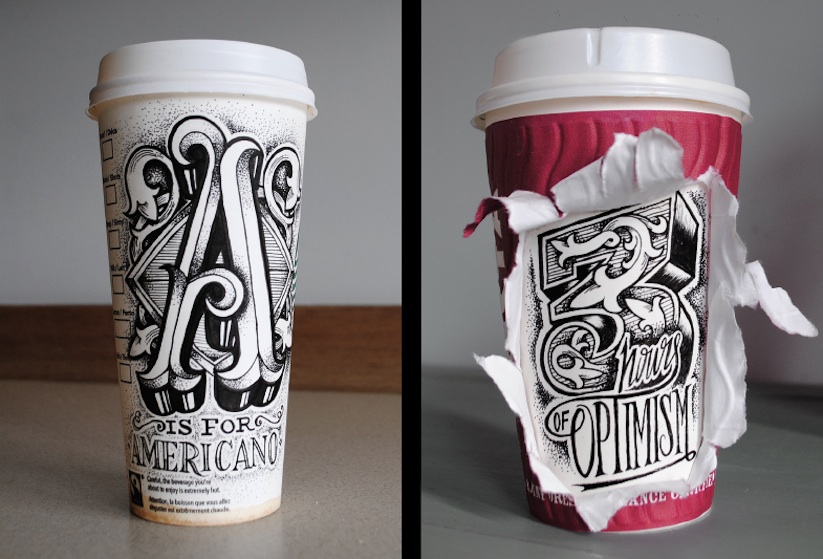
So one of my favorite clothing companies has put out a new competition looking for new talent to join their collective of amazing illustrators/artist. This has got me very excited as i feel i will be able to explore my dark side and try my hand at the kind of art i love most.
So i can only submit one design for the final design but im going to try come up with at least 5 designs to choses from and to make this my substance brief.
The brief they have put out is completely open in terms of designs and content.


So i can only submit one design for the final design but im going to try come up with at least 5 designs to choses from and to make this my substance brief.
The brief they have put out is completely open in terms of designs and content.


Here is the page that I will become part of if by some miracle I win,
http://rsiapparel.co.uk/artist/
TONY GRAYSTONE
http://www.sneakystudios.com/
Ideas and Development
I feel that this is my chance to go skull crazy and draw lots of different versions of the skulls i draw, also going to try out some more ideas with adding other elements to in and around them.
 |
Isograph Pen in sketchbook, then just changed the levels in photoshop to get the white whiter and the blacks blacker.  
So I have finished a design that i am happ y to submit for the competition, I had to play around with a t shirt template and but my design on it. I just downloaded ne from google and pasted my design on the top of it.
Here is another design i dad as always its a black print on a white t shirt.
  
Here i have used the same design but used it on the back of the shirt in large oversized print style, I have added some colour to this to see how it would look. I really like how by adding some red to the text it makes it stand out a lot more but its not over powering. The skull been done in gray which would be nice, but it would have to done using waterbased printing inks for me as i really don't like how Plastisol inks look and make you sweat loads under the printed area. Also over time plastisol inks crack and contract on the t shirt whereas water based inks just live happily with the fabric and just fade a little over time.
   
Process
Work with photshop and hand drawn image
Drawn on different paper then the layers stacked in photoshop to create finished image.
Dip pen and ink with different nips to get the style of lettering for the band logo.
Had to change file size and format to get design to submit, too large file size.
DPI was set at 400 turned back to 300 DPI,
Canvas size was massive so halfed it too made file size a lot smaller for submission.
SOme feed back i got from the guy at RSI
Hey Sam,
How are you? Yeh of course, as we said, we can only give our own feedback, which always remember is 1 persons opinion. I think the piece is well on the way, your using dot work well and it seems your beginning to use it in the right amount - some people can over do it stipple everything. I think the crossbones are the bit that need a bit more resolving but that is something that more drawing will solve in no time. Like you say, the winner nailed it, but i can’t believe that with practice you won’t be killing it in the near future.
Hope that helps
Not here to put anyone down only give you constructive criticism - always and i stress this….YOU ENTERED. I struggle with people that don’t try but expect to be great, all the artists you and i admire have worked thousands of hours to get where they are. It isn’t just boom I’m great
Speak soon
Rob
|
Wednesday, 23 December 2015
Responsive Illustration Friday Part 2
HAd to start a new blog post as me and Blogger have fallen out on the other post as this website is useless and annoying but thats a rant for another day.
Friday 18th December
SOAR
1hour 30mins (ish)
So this weeks word is SOAR not sore or saw but soar like a bird. So thats what i have done but i have used a Saw as the body of the bird and just added wings. This is a little jab at the english language and its stupid rules to have different spellings for the same sounded word baffles me and is one of thousands of reasons i struggle like holy hell with reading and writing.


Friday 8th January
TROPICAL
This weeks word is Tropical so the first things that came to mind was Pineapple, Toucan, Sun, Beach, and Cocktail., So my original plan was to draw a toucan on a beach drinking a cocktail from a pineapple but then i realised that would take ages to do. So i thought out of the list i like toucans the most. So a toucan was the answer to this weeks word a tropical bird. As i was drawing some toucan ideas i realised i could not get the feet to look right, first i tried to hide them behind a pineapple but i dint like that i dea so on my final idea i just stood the bird in a paddling pool as i feel that best represents a tropical british summer.
I also tried to do more of my final design using hand draw methods as i feel that when i play around with my designs in photoshop they loose something, so on this one iv drawn the outline in pen and coloured it using promarkers, then only tweaked the brightness and contrast to get the colors bolder and brighter.


Friday 22nd January
ORBIT
So this weeks word is orbit and with this one im giving myself 2 hours in which to complete the illustration. I knew from the moment i saw the word I would like to draw a tribute to Tim Peaks the british astronaut, who is currently up on the international space station at the moment and he completed the first ever british space walk. So i knew i was going to illustrate a spaceman with a union flag on his arm looking at the world as he orbits the planet.
 |
| Drew the outline with my fine liner before scanning in to photoshop to add colour. |

Tuesday, 1 December 2015
Responsive Illustration Friday part 1
FRIDAY 30th NOVEMBER
Illustraion Friday
I did a illustration for Illustration Fridays page, this weeks word was punch. I tried to do this in 1 hour so i drew out what i wanted to represent a punch so i did someone getting a punch in the face. First i drew it on to paper using a fine liner, scanned it in and opened it in photoshop.


FRIDAY 4th DECEMBER
WET
So this weeks word is wet. So i again gave myself just one hour to produces this week's task altho i think i may have gone over a little as i broke off to have some breakfast and coffee. The first thing that came to mind when thinking of wet was our beautiful british weather as we seem to have had lots of wet rain over the last few weeks. SO i decided to draw a bird flying in the rain as that's what i see a lot birds with nowhere to go to get out of the rain.

IN my sketchbook i drew this bird in the rain using a fine liner and scanned it into my computer so i could edit it and add colour using photoshop.


FRIDAY 11th December
UNICORN
So this weeks word is Unicorn and I have decided to spend a bit longer on my design for this one. I knew straight away I wanted to do something different instead of a standard looking unicorn. So as I was typing unicorn in to google to have a quick look at what others do to best show a unicorn's appearance, when in th edrop down box i saw unicycle so I knew then it had to be a corn on the cob mixed with a unicycle, or a corn graduating from university.
So I set about drawing a unicorn bike, it did not take me too long to do the design it was penning all the corns kernals in that took the time. Then when I rubbed my pencil guild out the new rubber I used took away loads of the pen too so I had to repen the whole thing.
I just used photoshop to color the image with 3 layers one for the outline one for colour and one for the background and fairy/unicorn dust.


Subscribe to:
Posts (Atom)