Wednesday 15 March 2017

FMP - T-shirts buying - LIVRID

I ordered three different companies that produces garments of clothing that supply the fashion/clothing world in bulk. I use as supply web sight that sells many different brands of clothing. Like I have said in a previous post i have used fruit of the loom shirts in the past and never really been a fan of the cut of the shirt, with the shirt feeling like a bulky square bit of fabric that likes your next way too much. So this time round im trying what others say are the better quality shirt.

When these shirts arrived I was very impressed with the quality and cut of two of the brand. So to see how they would last  once someone has bought a shirt from me and worn it. So what i do is wear the hell out of the shirts then washing them multiple times just to make sure the quality of the shirt last and will still look and feel good. So far the two brands if shortlisted have come out fantastic. So next step is to see how well they take on the inks when printed on and repeat the wear, wash, reapet test works with the inks on the material.

A selection of the t-shirts ordered.

Tuesday 7 March 2017

Branding LIVRID

THis was part of my OUIL602 project where I came up with the branding for the name im going to be doing my work under LIVRID. I came  up with business cards, logo, merchandise and a website. With this it will feed into my OUIL603 work as I will be using these to give myself and platform to sell and show my work on my website and the merchandise I can develop and produce. 

These are the hand draw business cards that I have started to make to add to products such as my prints and to hand out if asked for my contact details. I wanted to produce them hand drawn as i was skint and ran out of time to print some off, so just set myself the task of seeing how many i could get done in a hour and a half. I drew the pencil outline of each skull first then with a pen drew the outlines and dotted in the shading then using a brush and ink i blacked out the background. 


Playing around with other designs for business cards but these need more work and with these im going to scan in and clean up on photoshop then have them digital printed.


Here is the different designs hat have been drawn and mocked up the see what will look good for branding and promoting my practise. 
This is a logo im working on maybe for the inside label of the shirts and garments im going to be producing. 

Colours may vary - Out Of Order show

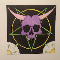
As a course we were ask to produce a print that could be displayed and sold at Colors May Vary in town. The title of the show was Out Of Order which at first sounded like a great title and subject to work to bu in fact it was quite difficult to come up with something for it. I settled for a transgressive theme as this would help to start tying a overall theme to my work. As devils and pentagrams are seen as a bit of a taboo still by a few this seemed like it may work for putting up in a shop/show and been classed as Out OF Order. 
I originally submitted the hand drawn design to the show but after speaking to a few other of my peers it was decided i should just print it off digitally and then i would have some prints to sell too.


So here you can see above my original submissions and abit of development,  thats been done using watercolours and inks and was just going to be a one off, but like i have already said  it would be good to have some prints for sale at the show too so i just hung a digital version of the illustration.
Below are the prints that will be for sale at the show itself all packed up and ready to be sold, they also  included a hand drawn business card that I added to each print with my details on so if the customer wants they can find my on the world wide internet.


So the show has been and gone and once again I have picked up all the prints that where taken to be sold at the show. I was not surprised that I was reunited with all of them again. This is the second time i have got all my prints back from a show we have held at the shop Colours May Vary and Im starting to think that if i ever get the chance to sell at the shop again then im going to have to seriously consider the material in my work. When im submitting work with the transgressive theme oozing all over it I am aware that this is a niche subject and it might not be appreciated by the masses but im sure with some more time i will discover where my work will best sell.  But for he time being if i have the oppertunity to take part in another show where my work is hung I need to seriously think what im going to hang and try find out what kind of audience the shop pulls to bet my chances of making any money. 

Monday 6 March 2017

Band Merch, Posters

I have been trying to focus on developing my text and lettering that I will need to add to posters, merch, brand products and more. So do band art work will force me to have to do this area im still unsure about doing. I spent a few hours mocking up 8 ideas for poster for songs past and present mainly focusing on the alternative metal genres.
I divided my A3 page up in to 4 section one quarter for each rough. And quickly mocked up the ideas using pencil and sketchbook.

GOing to try and work on developing most of these designs. Need to make sure i think about the lettering at the beginning of each design. so im not trying to squash it in at the end.