Friday 10 February 2017

We Are Boutique Mural

I decided at last minute to give the We Are Boutique Mural a go as i need to work on briefs that are out of my comfort zones to progress I feel. After seeing the brief i decided i could do it as i feel i know Leeds and whats could be used to illustrate its being.
I started out with some roughs and a little list of the most recognisable bits of Leeds that could be used on the design.


Theme
They would like the theme of the mural to be related to the location.

Consider:
"The Old Saw Mill” – location of the office
“The Fell” – the name of the room
 Leeds (location, history, etc.)

The Commission
A commissioning fee of £500 will be awarded to the winning designer.
The fee covers the design and the painting of the wall, which is to be carried out by the successful artist.


Deadline: 10th February 2017


With the name of the room been called THE FELL I thought it would be a good idea to continue with my understanding of using type in my work. So this has to be a big element in the end design.

Quick list of Leeds bits
Town Hall
Corn Exchange
Tetleys - Shire horse, Barrels Beer, Logo
Elland Road
Royal Armies - Logo, Old weapons
Leeds coat of arms -Owls, top hat, Lamb
Yorkshire Rose
Bridgewater place

Leeds Coat Of Arms


Getting started on the design with some right quick roughs, Owl Bridgewater PLace, corn exchange, Royal armouries log

Thinking about the text and the objects that could be included. The top hat from the Leeds coat of arms was put on top of the corn exchange, A shire horse that used to be of the tetley's history and a wooden cask barrel,


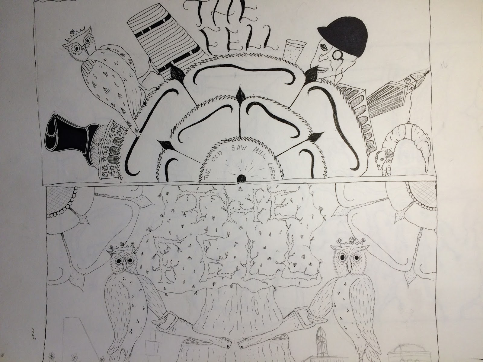
 ON the one above the top drawing is the yorkshire rose with its edges done like saw teeth seen as the building is know as The Old Saw Mill, I like the idea of this but on this design it has been done  way too big and it feels over powering and plane. Around the edge of this are different bits of Leeds from the buildings in and around the city the city owl and the top hat from the coat of arms on top of the corn exchange again. The man from the old Tetleys logo, On the far right side i tryed adding the lamb from the center of the coat of arms but i just looks like a withered old prawn wearing a lamb mask. Then I added the text for the name at the end and this resulted in very limited space and that what needs to be central and the main focus.

So on the bottom panel i drew something different starting with the text first  and seen as the meaning for fell is linked to chopping trees down that's what the idea around this design is. Using the owls in the poses they are in on the coat of arms with saws chopping down the fell tree. I liked this idea alot more then the other. Added some Yorkshire rose bits again i liked this idea but they lack character. Though about adding the a random cityscape of  leeds buildings but decided against this.
So this is the design I submitted I tryed to keep it as sketchy looking as possible and simple line work. The yorkshire roses have taken a direction i'm happy with and will probably work on it some more. the tree came out good too but i now feel i could of added more branches and flower leafs to help fill in the blank spaces between the different elements. The saw changed to one of them big two person or owl operated ones which works alot better then one each. The owl's well they could do with some more practise but im happy with them for now. ITs low in the number of things from the vast elements that could of been included to represent Leeds but on the roughs i did they looked very cluttered and it would of taken me longer to work out how best position them.

Response from client:

Hi Sam,

I hope you’re well.

Firstly, thank you very much for taking the time to submit a design for our office wall mural. We thought your design was interesting and got a few people talking about it in the office.

Unfortunately we decided to go with a different design, but thank you so much for submitting a design and good luck with the rest of your course!

Thanks again,

Sarah

I feel i could of submitted a stronger finished design. The elements like the owls are look very unfinished and the roses could of been developed further to make the blend in with the image not just stuck on the sides. 
The tree could of been used to fill the surrounding space as eel the design has too much unused space which makes it feel un resolved. 


After all this i wanted to see how the image would Work with abit of colour added.


Presentation Boards

Thursday 2 February 2017

Out Of Order

The course is soon to put on a show at the shop Colours May Vary in Leeds, The theme for the show is Out Of Order.
Im on the team that helps with the promotion of the event and the first task was to come up with the logo/brand for the event that could be used on the posters, flyers, email and social media. Some of us put forward a concept idea for the design, unfortunately for me it would appear that my approach is not what the group is looking for. This has not stopped me from continuing with playing around with the ideas I came up with. I really want to start focusing more on the letters and words that i'm going to start applying to the majority of my up coming work.


These are the first few things i drew out right quickish as i dint want to send too long on this at first. Tryed 3 different approaches to give myself some variety to play with and see which I liked best. Of course I choose the ones I had added some bones to.

I played around in photoshop adding the colour and effects to see what it could add to the final concept. I also thought about leaving it black and white and adding detail with dots and marks, this is a idea i'm going to work on at a later date.
This is the concept design I sent to the rest of the group. Its just not very interesting needs some texture adding

Later I redrew the idea but this time I added flower petals and a skull creeped into it and ruined it as i drew it right in the way of where I needed to added the petals.  Added a whole bunch of circles to the circles that has the lettering in to try give it the center of a sunflower look.
If I had spent more time on the design at this stage adding more dots to build up the shading to add some more depth to the image. This may have taken a few hours to achieve this but now looking at it it could definitely do with some detail.
Again got carried away in photoshop
I feel if I had left out the skull and just added the petals instead it would of made the overall look of the design more of a logo and less complicated. Along with the adding the shading better I feel i could of turned this into alot better design. So next time i will spend more time on the planning and development stages to better improve the final result. 
After seeing the design that was selected to represent the show on the poster, I feel I need to just make some examples of my work that are a lot more simplistic take out the detail and see if this better translates to others.

Decks for change -Final Designs

So the submission for this competition are open.
The deadline is before the 1st of March.
The final submissions need to be drawn on to a template that is provided.


Doing these designs before my dissertation took all my time and effort has given me something to jump straight back into and get the creative cogs going again. I had done most of the development work for the designs  so now its time to just take what iv done and transfer it to the templates then scan and submit.


On my first attempt it was decided to get my water colour paints out and add the colour that way, what i didn't think about was the paper I had printed the templates on to, this was just 150gsm cartridge paper and when i started to apply the paint this became a issue as it had a terrible looking finish where i had applied some thickish coats of paint. The paper was not made for my way of using watercolors and it became difficult to apply the paint without the paper peeling away and leaving a mess.


I decided for my next attempt I would do it in my sketch book first and use Promarkers to add colour. This worked out fine and once I had finished I wished id of done it on to one of the templates as it came out good. This gave me the practise i need hopefully for now putting the design where it needs to be.

So heres the design I submitted I was not happy with my final submission but I just couldnt seem to get the image I was looking for on my final attempt, as I found out the submission needed to be hand done. I liked the fact it needed to be hand drawn but it just came out rubbish. I feel I could of got the colour a lot better applied if I had done a few more attempts at this but and more importantly I should've attempted to of done the development drawings on the templates so when  I had a designs that I was happy with it could of been used and not attempted to be redrawn. I also feel that my design with the skull brain and mouths on translates the idea of mental health a lot better. The designs that got submitted is conceptual and people struggle to understand what its message was. If I had added some text to the board highlighting the issue.
Also I need to start to test out my materials on the papers im going to be using and try to think of these issue before its too late and time and materials have been wasted.


Presentaion Boards

Wednesday 1 February 2017

Statement of intent

Leeds College of Art
BA (Hons) ILLUSTRATION
Level
06
OUIL603 Extended Practice
Credit s
60

STUDIO PRACTICE
Statement of Intent


Name
Sam Metcalf
Blog Address  s-metcalf1417.blogspot.co.uk
Date


Rationale

Needs-                                              Wants-
Screen print                                       Money
Quality of end product                       Product/Branding Development
Drawing shills                                    Digital Knowledge
Painting skills                                     Time Management
     Typography                                        Branding Development
Themes / Subjects

Skulls
Mental Health
Products / Methods of Distribution

Mental Health ?   Merchandise
Dark
Skulls
Type/Typography


Brief 1:    Decks For Change
Deadline
TBC
Rationale:
Come up with a design that reselects a issues in sociality. Focus on mental health
Brief 2:  Stranger Christmas card design
Deadline
Missed
Rationale: Come up with a design for a Christmas card design “seasonal” that can be used by all people. I did a Christmas turkey in a santa suit and a skull Rudolf with I shiny red nose.
Brief 3:Traveling Man Poster Design
Deadline
27th October
Rationale: Do a poster design Fan Art was the subject and a set 5 color pallet so I am going to do a poster for one of my favorite films Mars Attacks.
Brief 4: Secrete 7 – based on music I listen to
Deadline
TBC
Rationale: Im wanting to enter this again next year so to help me get comfortable with illustrating for album covers/ merch im going to try do a cover every week of one of the songs im currently/at the time listening to.
Brief 5: Grunhilder -1965 VW CB Camper

Deadline

Rationale:
Been asked to come up with a design for the rear back upper panel on the van,
Given objects they would like in the design are Skull,Dagger,Yorkshire Rose and the name of the vane Grunhilder. I have drawn and painted many designs for this already, but with been a massive VW fan its proving difficult to be happy/confident in any so far.


ACTION PLAN – use this section to identify specific tasks that you need to complete in order to resolve the brief.
Brief
What do you need to do?
Deadline

1
 Decks for change,
Completed most of the design I want to submit just have time to give it some final tweaks and get colors right.
Finish the designs final tweaks
TBC

2
Christmas Card design
Missed the deadline by a day by writing the wrong date down. Had the design finished for a while just forgot all about the submission. A good start but will hopefully put the design to some use.
Missed.

3
Traveling Man Poster Design-
Already made a good start on this over the last couple of days. Done a first mock up with the main elements but still need to render the text and finish off a space suit. Also add some detail to the background. Hope to have this done by Sunday 23rd
27th October

4
Grunhilder -1965 VW CB Camper
Been asked to come up with a design for the rear back upper panel on the van,
Given objects they would like in the design are Skull,Dagger,Yorkshire Rose and the name of the vane Grunhilder. I have drawn and painted many designs for this already, but with been a massive VW fan its proving difficult to be happy/confident in any so far.

TBC

5
Secrate 7 –
Im wanting to enter this again next year so to help me get comfortable with illustrating for album covers/ merch im going to try do a cover every week of one of the songs im currently/at the time listening to. 
1 a week