Sunday 14 May 2017

Summative Statement

This Unit has given my clarity on the direction on where I want to take and develop my practice now I’m finished at LCA. It has given me the skills to be able to continue and grow my personal 
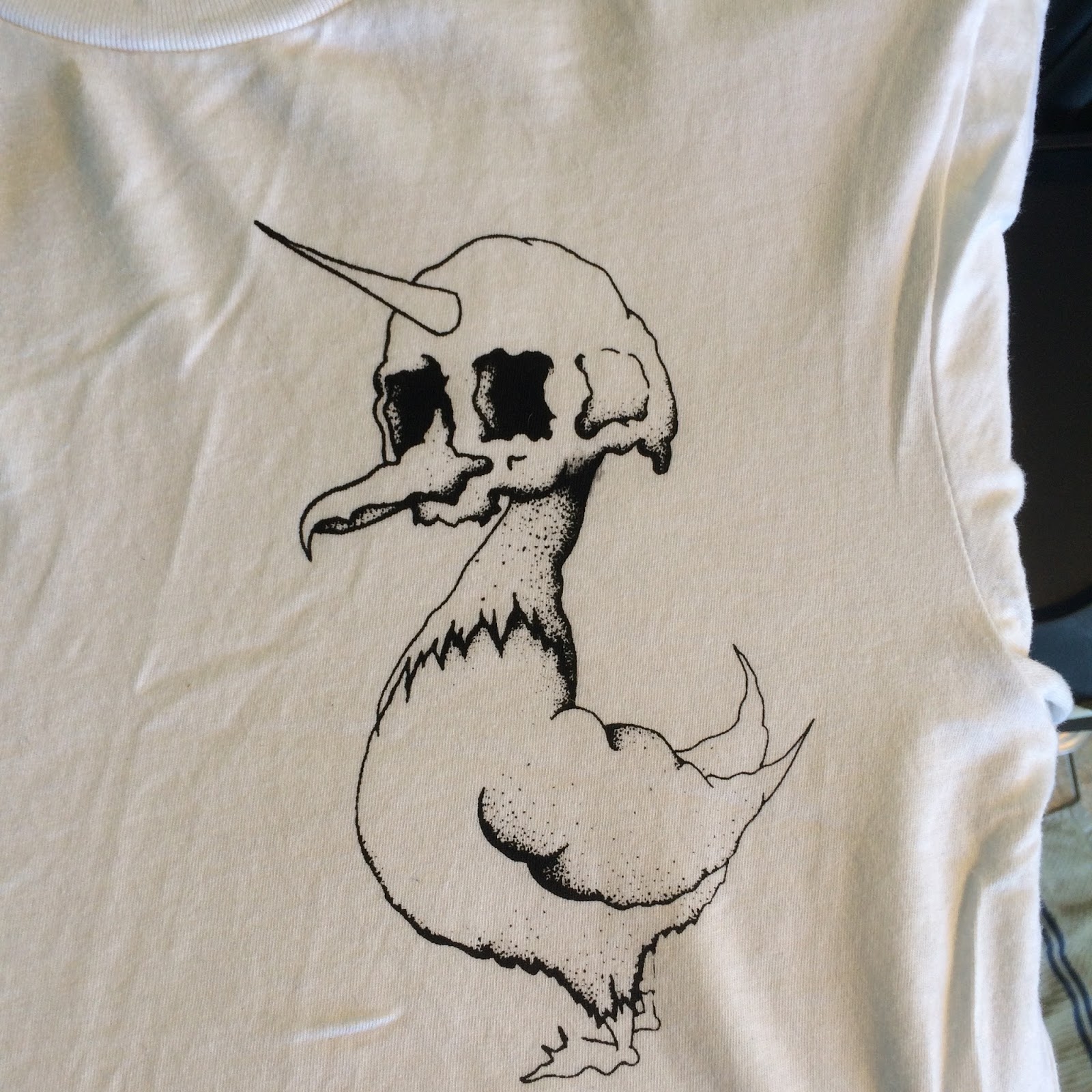
work via my brand LIVRID and as I have started to produce work to sell via this outlet. It’s helped me find and develop freelance work for ordinary people from out side the education system. I have worked on briefs that gave me the opportunity to communicate with clients to work to a brief set by them. This has given me valuable knowledge of working on projects out of my control at the speed they move and left me waiting around for communication.
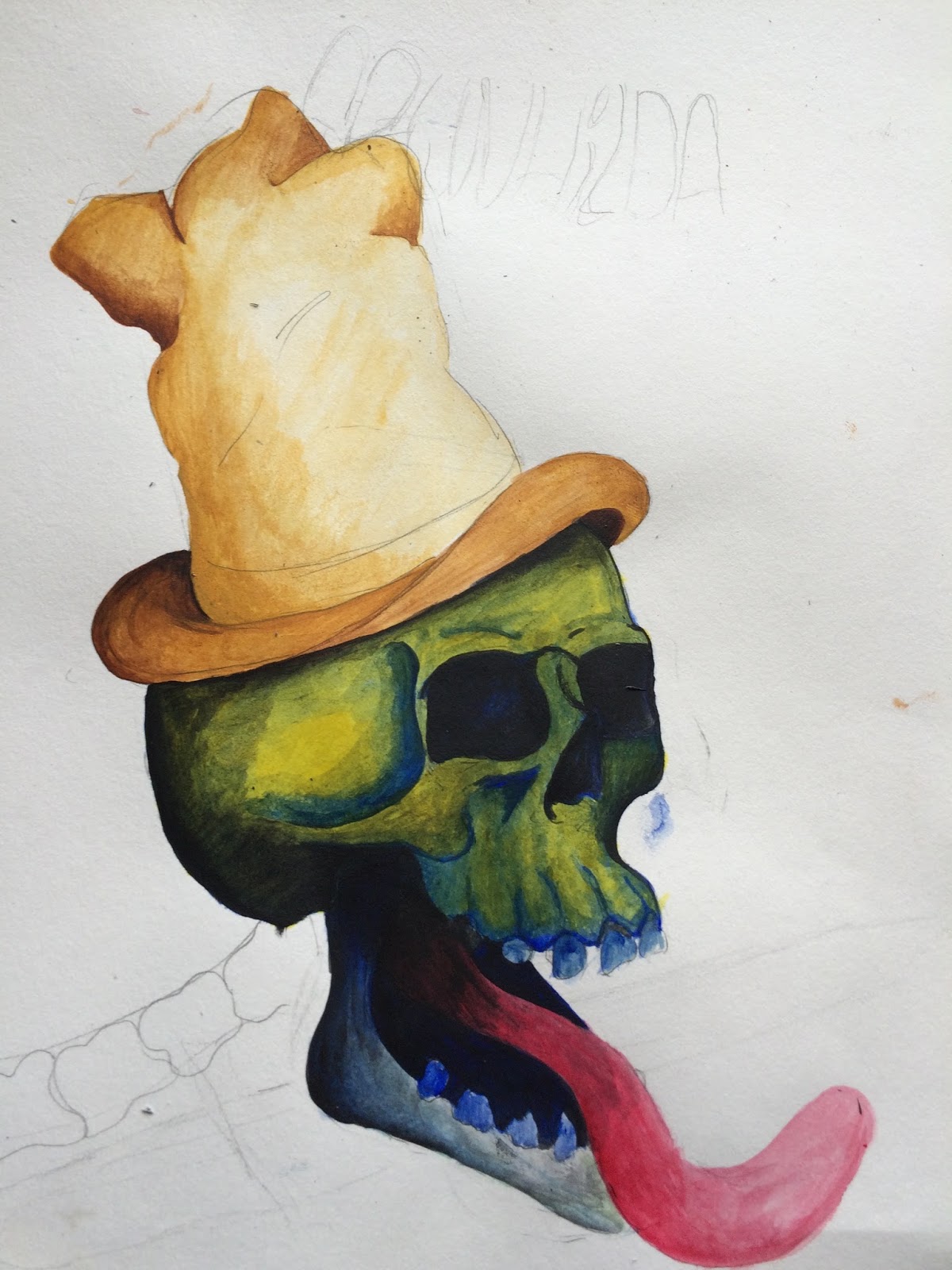
Looking back at the other work I have produced for this unit I have had a variety of successful final products that have been displayed and sold on to the general public, with some work selling a lot better then other work has informed me what I need to consider when knowing where the work is displayed and what sort of clientele that will be viewing and buying the work needs to be considered when coming up with ideas.

The unit has given me vital skills and knowledge that I need to now take my work and join the creative industry and try and make a name for myself to get a successful career going. With my website up and running and my continuing development of my portfolio for the first time I feel some confidence in the next step in my creative journey.

Project Report

Final Statement Of Intent

Presentaion Boards

FMP- Fowl t-shirt range


Out Of Order show


Desck For Change


We Are Boutique


Mars Attacks


Stranger Christmas Card


Red Beard Developmet


Friday 12 May 2017

FMP - FOWL tshirt range - LIVRID

So I have decided to start my brand LIVRID off with a range of t shirt that combine my love of skulls and birds. Mainly focusing on FOWL types of bird such as Pigeon, chicken, goose, swan, turkey. I need to start off drawing out some quick design of the different birds to see if i can combine them with skulls to give it a unique look. I will be printing these designs on to t-shirts my self in my shed so to keep the colours to just black and white should help me design them a lot quick as i wont have to mess around finding the right colours.

This idea has grown from a design I did at the end of level 5 where i drew a bird skull on a bird for a bands poster mock up. I really liked the design and know at some point i would have to develop the idea to see where i can take it and how the imagery can be put to use.


I started out with some designs to see if my ideas would work. And I liked how they looked from the very start. Im still going to work or other designs as i feel i can keep refining these designs to improve them, trace the image or just take the shape, position  and build on it or simplify it.


I put beaks on them but with then attached to string so it appears that they are not real just fancy dress like. 
I really liked the idea of these designs as i feel they will stand out from the bog standard designs that are done. So i set to work coming up with a few more to be developed, They are to be filled with dot work building up the shading and tones that will give the illustrations so depth fingers crossed. 

I have just received a order that has some 93gsm thickness paper, with this i'm going to attempt to draw on the paper then try and expose a screen using my 1000w exposure lamp without taking the image anywhere near a computer. Im doing this as im starting to notice the differences to my work once it has been scanned in to Photoshopped and then printed back out. It seems to take something away from my designs. So by taking the drawing straight to the screen it keeps all the detail in the image. 
And it worked I don't know if it was just luck but I got this to expose almost to perfection on my first go which was brilliant as I only had 2 screens I could use. I set it to the settings I use to use when using thick tracing paper which is the Lamp set to 21inches and exposed for 16mins, when doing this again on my next set of images in going to expose the screen for 30seconds less just to see if this helps get the really fine detail to expose a little better. 

Here is the printed image on a shirt. Im very happy with how it has come out and very happy I got this from drawing to print with NO COMPUTERS input (i'm starting to hate computers again)


 This was the second half of the first screen as I like to put at least two designs on a screen this helps with space saving (less Screens) cost and speed of get more then one design out at the same time.
So the next step is to play around with my expose times when exposing the screen just to see if I can get every bit of detail to show. And to finish off the rest of the  (try for 4 more plus promo material) designs ready to be applied to shirts.

These are the next designs that i will be attempting to print, I was going to select just one but I have decided that why not do them both. Along with these I will also be putting a design thats off the Fowl subject but its still a flying beast with LIVRID text on. Its a bat hung upside down with a skull pocking out from behind its wrapped up wings. With this one I want to see how the size of the design will look on the shirt as its long and thin im not sure how it will come out. Aswell I will be putting these shirt designs printed on t-shirt on sale on my website, so it will be good to have a variety of designs taht I can see of which sell well and which to improve or scrap all together. The way in which im having to print due to the cost of equipment and what i can afford  means im having to try out a different way to usual of printing.


So I set my timer to 15mins to see if this made a massive difference and the results are a little better but i think i will go down another minute again to see if this makes the process and detail better. At 15mins the detail has come thought a little better but still I feel i can get more out of the image once exposed, its just a matter of testing until i go to far under exposing then i can build up the time to hopefully maximize the detail coming through on the screen.

To help me just print the one image I want after covering the rest of the screen with tape I cut out using card the size of the area where the image is. Then I cover the card in parcel tape too and use this to cover the area the image is i dont want to print. The tape helps protct the screen and the product. 

Here it is just after I have cleaned the screen down as you can see the water does get to the card after a while but as its just card and parcel tape its not costly and is quick to make a quick replacement if and when needed. . Also with having to angle and move the screen constantly ment I was getting ink everywhere and not realising  until I took the t-shirt off the print bend and noticing ink all over the t-shirt off my hands. This method is a area I completely need to change after starting to print again on the t-shirts I started to get ink coming though where the other designs where covered and I had rinsed the screen off it held some ink under the tape and then this came though the screen when I next added pressure to print a shirt. The detail of the other design came out great but it ruined the shirt. In all I have wasted about 8 shirts with me been not been carful when printing and from spilling coffee over two of them. I really need to order more screens so I can have one design on a screen, this will hopefully stop mistakes from having too many designs on te screen.


If I was to use a bigger nibed pen this could help me as i'm using my .25 isograph pen to fill in the shading and detailed areas, A thicker pen would block out more light and maybe be able to translate the detail better, but this could also compromise the overall look of the image i'm looking for making it too bold. 


So this is my range so far and now they are all together hung up with added coffee stains on a couple of them just what I needed. This is now starting to look like i wanted it to look but I can also see massive improvements thats could be done to give the overall better results. Such as make all the designs the same size so it looks more professional when all hung up together. The positioning of the image is something I need to be really careful with when producing these shirts, on some of these first samples to be done the positioning of the design is off and when the shirt will be wore the design will sit very close to the armpit of the wearer and not look right. When I next print the next batch of shirts I have worked out that if I follow the edge of the collar down to be level with the bottom part of the sleeve this is about the spot on place place the design wants to be printed. To help me even more Im going to invest in some smaller screen that will fit just one design on and a smaller squeegee so I can better position the screens, as its difficult with the size screens I have now.  Getting them into the correct position is difficult  which can result in me wasting t-shirts costing me money. 
I want to really print on more then just t-shirts such as hoodies, jumpers, prints of the designs, hats these are coming I just need to get some more hours at work to be able to afford the initial costs. 
Once this work is submitted I will continue to develop , design and produces this brand as I have had a nice interest in the work I have made so far for this brief. Going forward I want to make the brand start out in the quality of products I produce after seeing what things cost to make a good quality product its where I want to be. I feel that if you provide a product that has been well thought out in the materials used to produce it it shows in the end product. This with the fact with me screen printing the shirts myself I wont have over stocks of designs that don't sell, I can just make whats been ordered, no over spending and products. 

Presentation Boards

Thursday 11 May 2017

Fowl t-shirt Promo online digital conent

So along with doing the t-shirt designs and keeping them as non digital i still needed to scan the images in. So with doing this I had a quick play around with these in photoshop to see if when creating the promotional side of the brand some images are going to have to be digitised.


As I have run out of time to actully put theese to any use for my project when I continue to develop this range of shgirts I want to use these digital enhanced images for the pomotomal side of the project. 

Wednesday 10 May 2017

Red Beard Food + Drink

I have been contacted by Red Beard food and drink, they have asked if I would be interested in working with them to develop the branding for the brand and the labels to go on the products. They have contacted me via social media after seeing my work on there. The company is just about to start out and they want some designs that are of a transgressive nature with skulls, gfire with a heavy metal feel. This is going to be a brand that is aimed at the adult population and will have products that are alcoholic. They guy behind it is called ben and he is a heavy metal music fan with a passion for making food and food products. 

Here is the list of products Ben is wanting to sell, I have removed the ingredients from this list as I know Ben has spent some time coming up with his own versions of these so id like to help protect his hard work. I do have the list of ingredients he uses so I can use these to help come up with some illustrations for the designs. 


Sloe Gin -
Limoncello - 
Limoncello Curd -
Whisky Sour Marmalade - 
Extra Thick Cut Blood Orange LIqueur Marmalade - 
Sloe Gin Jam - 
Bloody Mary Chutney - 


Pretty proud of this man.

Looking forward to working with you bud.

Will be sending some photos and ideas to you man.

Cheers

Benneth!

Here is what he is thinking around the designs for the products, he sent me this quick rough he put together. This should help be get started on some designs. 

So I have started trying to Develop some ideas for this company. Its new to me trying to combine my transgresive theme with food things. So I started by


Adding a beard to the logo is a must seen as its in the name and it needs to be a nice red. Here I have just taken a skull and added a wobbly triangle to resemble a beard. I like how this could look, this is something i'm going to play around with see how I can make the beard a main feature of the logo. Having the teeth in or out is something i feel Im going to speak to the client about and see which he proferes, also with the hat and if a hat any specific kind. When speaking with the client he has made it clear he wants the logo to be a leading visual for the brand and he may want to add it to merchandise as well as the products.
Speak to client about :-
Hat,
Beard shape,
Teet,
Moustache,
Any specific colours hes thinking of having on the logo.


I have sent a some photos of the work i'm doing to Ben at this point just to show him where im at and that im on with his request. He was very happy with what iv done so far and said it had motivated him to get on with this project too. 

Added some colour to see if this will help to make up the image and show what potential the designs could have with colour. I have just used flat colour to start with so I can start to see what colours are going work to get the desired overall feel to the branding. This is where I need to spend some time trying to work out how to get these to look more brand friendly as they are a bit in your face with the colours iv used. 

 Not too sure if the flames may give off the wrong image now after adding this work to here, flames on food normally mean hot/spicy and Im not sure what sloe gin jams spiciness is. With this said I would like to get fire in the images somewhere as this is also a good indicator to hell and the transgressive theme.

 On this one I added more demented sloe berries falling and melting into jam. After looking at all the images iv played around with photoshop and im just not happy with how they are looking and feel i need to spend much more time spent on the master drawings when i produce the final images. At this stage i need to add much more detail to the different elements as I feel like they are way too cartoony for brand of a food brand. The images need some depth to give them a more 3D overall look and if i'm going to add flames these too need to be drawn and developed so they blend in to they surroundings and are not such a impact.
I also want ask Ben if they is any chance of me sampling these products as this may give me a better understanding of the taste which will help me with the designs, if they are sweet I can make a sweet design , if its sour make a sour design.
Another thing he has commented on is the jars and bottles hes going to be using are interesting in their shape and have some caricature so fingers crossed they are going to be design friendly as in the surface shape i have to work to.
IM getting really worried i'm not going to have time to finish this project before the submission date. The project will still continue I have to submit it unfinished for 603. Im waiting on meeting with the clients to discuss the project and fingers crossed try some samples. 

Development Presentation Boards.

Wednesday 26 April 2017

Paint a Toy

https://www.thetoyfinder.com/

I was contacted by Nick at toyfinder.com to see if i would be interested in receiving a Fo Chisel (http://fochisel.com/)and seeing what I could do with it, I jumped at the chance. When I received the toy I was surprised to see it had a chisel in the box this surprised me as i thought it was just the name of the toy not a discerption.
So I have stared at the toy for a number of hours trying to work out what to do with it and have decided im just going to paint a design on the wood as I don't have the skills or space to start smashing the chippings out of a bit of wood. I just don't know where to start do I just go for it and mess up the wood and see what happens or do I find a person with a band saw so I can cut section out of the wood and ret get some shape going. I know your suppose to chisel it but with the size of the chisel provided and the size of the would I feel i'm going to have to do a degree in wood work to be able to work it into anything. All I can see happeniing is me getting frustrated and injured with the end results not been worthy of using. So I think using a band saw to cut the wood to shape and then use electric sanders of different varieties to then further shape and smooth the wood before painting it. Where im going to find the time and equipment to do this I don't know.


Monday 17 April 2017

Final Major Project

Leeds College of Art
BA (Hons) ILLUSTRATION Level 06
OUIL603 Extended Practice Credits 60
STUDIO PRACTICE
Project Proposal

Name
Sam Metcalf Blog Address – www.s-metcalf1417-sp.blogspot.co.uk/
Date

Rationale

To have a range of t-shirts designs for my brand LivRid. Have a set of t-shirt that can work as a range/ set.
Looking at creating a set of designs focusing around the word Fowl so will be bird  elements  that are associated with the fowl range with the mighty skull


Themes / Subjects
Transgresive/nature/wild life/ skulls/ Macabre
Fowl

Final images to be built up out of dots, maybe crosshatching

Black and white for screen printing, maybe online promo could have a bit of colour to help get peoples attention.


Professional Context  & Contextual References


BA (Hons) Illustration - Level 06
OUIL603 Extended Practice – Major Brief

BRIEF TITLE  - Branding a Brand

Brief - Design illustrations to be put on t-shirts

To design and propose a set/range of designs that can work on clothing garments to promote my brand Livrid.  The range will be called my ‘fowl” range and it will bring poultry and skulls together in a macabre style of spot illustrations.


Products & Proposals Function & Context


Designs for clothing garments, such as t-shirts, jumpers, tops


Skulls, birds,
Context & Distribution Audience & Tone of Voice

To be sold on my website and stalls to be held at events.


Transgresive, macabre anti establishment

Additional information/Considerations

Deliverables

-Hand Drawn
-5 designs to be put on t-shirts
-Screen Printed on to t-shirts by me
-Put On Sale on my website


ACTION PLAN – use this section to identify specific tasks that you need to complete in order to resolve the brief.
Week What do you need to do? Deadline

1

Come up with numerous designs, pick the best

2 Develop designs then trace and  transfer to thinner paper one that can be used as a positive when exposing the Screen.

3 Order and sample whole sale t-shirts find the best to fit my brand

4 Screen Print shirts

5 Add to web sight then add promotion of products to social media pages.


MAGAZINES / JOURNALS / ARTICLES – (include publication date and details)


ON LINE REFERENCES  / WEBSITES / ARTICLES (include specific urls)


OTHER REFERENCE MATERIAL (Films, events, exhibitions, conferences)


BA (Hons) Illustration - Level 06

OUIL603 Extended Practice

STUDIO PRACTICE

Project Proposals
10 steps to producing persuasive project proposals


1. Set clear aims and objectives

2. Be SMART

(Specific , Measurable , Achievable , Realistic , Time Conscious)

3. Use words from your brief

4. Justify the need for your proposal

5. Describe your audience

6. Describe your motivations

7. Consider the reader

8. Eliminate vagueness

9. Visualise the ending

10. Assume nothing


Tuesday 4 April 2017

Grunhilda - VW Decals

I have been approached to do some decals for a 1964 VW split screen camper van. The client approached me after seeing my work online and asked if i could do two designs one for each side of they van, they want a vinyl cut out or a high quality sticker. They have asked if it can be about A3 in size as that the equivalent height of the back panel, this will need to be properly measured near the end so i can make the designs the correct size. The specifications are the it includes a skull, Yorkshire rose, a dagger, the name of the van Grunhilda.


This is the dream machine that i'm getting to put my work on The back top panels of he van  of the van. The van is going off for some cosmetic and interior work so i wot get to see it again until a much later date. So I will be going to see the clients to show them my work and give them a variety of designs to choose from and help in the direction they would like the design to go.


So I got to a point where i had a few designs ready to show the client and I had a few options for them to choose which direction They wanted to take the final design.

I had a final meeting with the couple who owned the van to see if they where happy with the designs i had been doing for them. I took along every design that i thought would be able to be developed into the final images. They where very happy with the designs I had come up with and the amount of options i had for them , this was a slight problem as I gave them too much choice as it took forever for them to finally decide on the one they wanted. This made me realise you can do too much work for a customer and as i'm the 'professional' I should of just taken the designs I was happy to develop and the best looking ones, so next time i will select what im going to show them and have the rest as back up just in case the customer needs more options.
The meeting went really well and i left feeling right proud as the feedback i got back was awesome. They had a few little alteration to the designs they had selected so I got them done straight away and sent the finale designs over to them to see if they where happy with the final designs, they where .

Development


 At the time I did this job the owners where having some major improvements done to the van which was good as the van needed a little TLC but became a bit of a nightmare when it came to measure the space the design was going to go and to get the paint colour to see if any other colours could work instead of black and white. 
Between the customers and myself we decided that the design should be keep to black and white to minimise the impact on the overall look of the van, As the van is a classic and 1 of only 20 left in the world I really don't want to overshadow the beauty of the van with my designs.


 I did alot of different designs for the clients to choose from the only issue I was having was coming up with two similar designs that i could work with. I was happy with how most of them could of been developed into single designs but that was not the customer's request.


MEETING WITH CUSTOMER

These are the final designs that have been chosen by the client, they just wanted the rose on the bearded skull to be under the beard and not on the top.


Now I have the final designs done I have researched where i can get these made into good quality stickers that will last a good few years. I then realised that I had had some stickers made about 4 or 5 years ago from the guys over at StickerApp.co.uk. These stickers are still going strong have have not faded on discolored in any way. So all I now need to do is get the proper measurements And send these to the design and send it off to be made into the sticker required.