Artists such as Melvyn Grant, Tim Bradstreet, David Patchett, Mark Wilkinson and Hugh Syme have contributed to Iron Maidens covers but it is the legendary Derek Riggs that is responsible for their best work.
There's no doubt about it - Iron Maiden have had the most consistently brilliant album covers in rock history.
I have chosen Iron maiden as they artwork has always been they in my life and the fact that Eddie is as big as the band itself they have done something very right with they merch.
http://www.planetrock.com/photos/the-art-of-iron-maiden-670062/
www.Gigposters.com

Found this book whilst browsing in a big named book shop in Leeds centre. I really liked it as it had up to date artist and gig posters that are familiar to me. Unfortunately I was told the shop was not a library so had to put the book back. Going to see on Monday if it's in the library at uni if not ask if they can get it in as I feel it will make a very good book for artist and reference materials.
www.mexicanchocolatedesign.com/
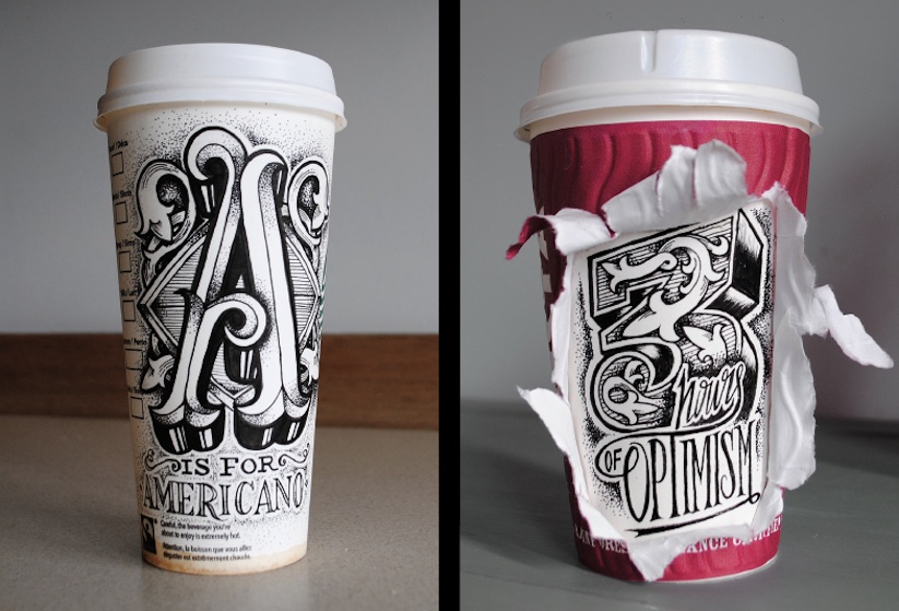
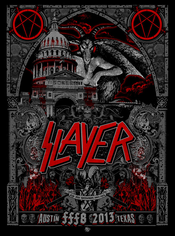
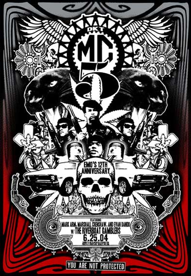
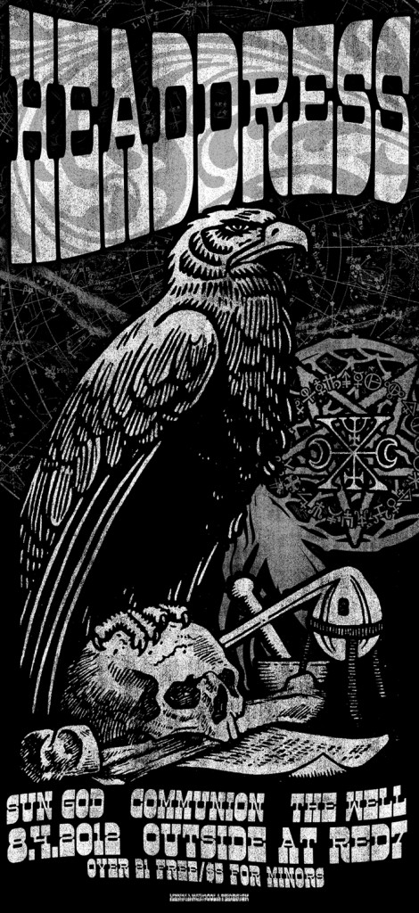
Gig posters
www.drewmillward.com/
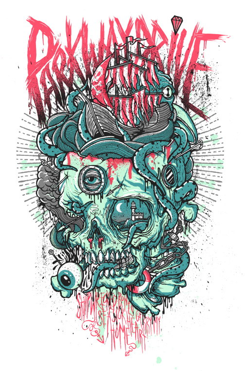
Drew millward is responsible for one of my all time gig posters it was done for my favorite band the mighty GALLOWS he has also done another favorite of mine and for another band i'm a big fan of Parkway drive. I feel that these poster not only look amazing they are a great way for a band to promote themselves and attract more fans. I know this to be true as this is how i discovered Parkway Drive after seeing some art work for them i went home and looked them up and have loved they music since that day.
 |
Add caption
I feel that gig poster or a advertisement for a band can be a lot more then just that show or that album and i feel that the on line presence of a group could be even more enhanced if the techniques are brought uptodate. What im trying to say is posters like these could be brought to life to get even more attention if say you was to design the poster then work with a animator to bring the poster to life, its a area i'm very keen to explore and see if it could be done effectively.
|