Her are a some quick first ideas to try illustrate some of the things i think represent her work. I have just tried to start off with basic and quite obvious images using company logos i know Naomi has had dealings with in her work. Using big corporation logos try work out how they can some how represent their dominance over the world.
 |
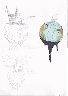
| This is a few quick ideas that i played around with, they represent the Shell Arctic Drilling which i have been following over the last few months. as it it turns out that Naomi is too a activist against the drilling too, i have been following this protest through the group Greenpeace and have signed the petition to have it stopped. |


 |
| Ideas for how to show global brands and they world domination. |
 |
| Branded for life, tried to have graves of people who are loyal customers to global mega brands and they even have them on they graves to continue they support even after death. |
I have done research of what Naomi's books are about by watching interviews and talks she has given about her books and believes. This is a great way to get to understand what her message is with out me struggling through a book to only barely understand what is going on. As i struggle with read quite a bit this seems to be a good option,
I have also watched the film The Take which is all about the global financial crisis and how big companies are taken on by the workers even after the fat cats have given up on they profit making ways.

Climate Change
In her latest book This Changes Everything Naomi talks about how in order to take action to to tackle climate change there are only radical ways left in which we need to change how our planet is run, to sort out the extreme problems we are facing now and whats too come. She talks about its not just what we do to our planet in terms of the harm we are doing but also the fact that the way in which is run by governments and the elite has to change as all this destruction is been caused due to the profits that are to be made.
From what i have listened to so far one of the main points that has stuck is the temperature changes our world is going to face and its this that will have such a massive and destructive impact on our fragile little planet. Even tho it does not sound like a massive change it will have a global impact and every person, animal, fish, insect and plant will be impacted massively if not even wiped out from it. These numbers and 4 and 6 degrees in temperature.
Also the big dad evil corporations and governments that are destroying the earth just to line their own pockets.
 |
|
 |
|
 |
| How the sustainable industry is treated by the fossil fuel giants. |
 |
| 6 degrees C make it abit more evil looking death metal style |
 |
|


These volcanos where a attempt at some realistic images, i wanted t put some kind of evil image in the smoke that could represent the global companies
Glodel energy compnys messing with education for they own benifit
: http://energydesk.greenpeace.org/2015/10/23/data-top-universities-take-134m-from-fossil-fuel-giants-despite-divestment-drive/
DEVELOPING IMAGES FOR POSTERS


DEVELOPING IMAGES FOR POSTERS


 |
 |
 |
| Skull and oil rig on decaying earth Charcoal. i used charcoal to try get the gradient i was trying to achieve . once i sacnned it inn to the computer and played with th levels and brightness i could turn the black pure black and make it seem like the death earth is all erie sat alone in space. |
 |
| Going to try add west minster to the top of this skull to represent politics the Klein talks about in there change to attitudes in global warming. |

So iv come to preparing for print and iv decided im going to try and do mine hand drawn using tracing paper and a black china marker. To do this i have to make a positive for each colour, so to start with i marked out the layer which is going to have the color and then on a different piece i laid it over the top of my one already done and marked out the black and tryed to see if i could work in the gradient i wanted.

Printing
So i finally got to the print room to expose my screens and see how well the china marker and tracing paper was going to work in my final prints. Producing the screens was not a problem and when expoossing my screens on the exposing unit i was surprised to learn I only had to expose them for 11 seconds that's all it took. The effect that i was left with was good as when the screen had finally dried and i did a few test prints it looked like I had coloured them with a crayon which i liked. I ran into some problems with one of my prints and that i could not get them to line up properly when trying to print the different colours, I think this was down to my tracing paper positives not been drawn correctly and must of been off line when i did them, I feel as well i did not put any registration marks on my different screens and this made it that all more difficult to line up the colours, but i loved the experience of doing multiple colours and i know what i need to do next time to get them to have a better finish .


