Wednesday 29 April 2015

OUIL406 Visual Communicatio End of Module Self Evaluation


Leeds College of Art
BA (Hons) ILLUSTRATION Level 04
OUIL406 Visual Communication Credits 20
End of Module Self Evaluation

NAME SAM METCALF


1.  What skills have you developed through this brief and how effectively do you think you have applied them?

I Feel from this Unit my skills on Photoshop have improve dramatically and I feel comfortable using it now. I have produced all my work using it except for the vector task, I feel it is fast becoming a tool I will use all the time when I need it.
Also the use of a dip pen and ink, I have started to use these all the time and really like the effects you can produces with these, the amount of different nibs is fantastic and all of them have a world of possibilities, definitely a big game changer for me.

2. What approaches to/methods of image making have you developed and how have they informed your concept development process?

Sketching ideas over and over again working out compassion how the image is arrange. Using pencil crayons to add colour gives a great indicator to weather the colours I’m going to use are going to before I spend too much time on the final images.


3. What strengths can you identify in your work and how have/will you capitalise on these?

My use of Photoshop has helped me active effects that I would otherwise not been able to do or if I had done them taken loads of time and materials testing and making.  I feel that I have found a new tool in using Photoshop and will capitalise on this by using it more frequently and just keep learning and developing to further my practise with I wider range in my tool box

4. What weaknesses can you identify in your work and how will you address these in the future?

I found illustrator to be a real pain to use and way too fiddly of me, this had a real impact on the final images I produced as I could not do what I wanted it to do . Practiced put in loads more time getting to understand the tools and how they work and watch tutorial video’s to further my understanding on how the program works and the tools it has within it.


5. Identify five things that you will do differently next time and what do you expect to gain from doing these?

1. When using a new program like illustrator start off with simple ideas don’t choose complex images that have way too much detail for my level. I feel this would benefit my final images with better results and build my knowledge of how the program works at a better.

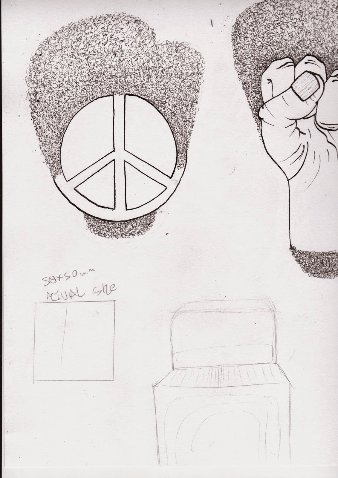
2. Check the measurements properly in the very beginning. This will not make me make loads of work that takes pressures time to produce only to have to re do it as it does not work at the correct size.

3. Don’t just think about ideas with different new methods try them out. This could lead me to develop into new areas and get better results then my tried and tested safe I know what I’m doing processes that I know what the end result will be.

4. Try adding bits of text big or small probably hand drawn. Could add a new element to my work with key words, verses or sayings that could be connected to the subject.

5. Research a lot more in to the subject at the start of the unit. With better knowledge comes greater visual power.  


6.How would you grade yourself on the following areas:
(please indicate using an ‘x’)

5= excellent, 4 = very good, 3 = good, 2 = average, 1 = poor
1 2 3 4 5
Attendance 5
Punctuality 5
Motivation 4
Commitment 4
Quantity of work produced 4
Quality of work produced 4
Contribution to the group 3
The evaluation of your work is an important part of the assessment criteria and represents a percentage of the overall grade. It is essential that you give yourself enough time to complete your written evaluation fully and with appropriate depth and level of self-reflection. If you have any questions relating to the self-evaluation process speak to a member of staff as soon as possible.


A copy of your end of module self evaluation should be posted to your studio practice blog. This should be the last post before the submission of work and will provide the starting point for the assessment process. Post a copy of your evaluation to your PPP blog as evidence of your own on going evaluation.

Notes

Person of Not pt2

Final Ideas for A2 post, 3 Postcards and 4 Stamps


STAMPS
These are the final ideas i did for the 4 stamps i was was so pleased with how they looked. Simple strait froward and no editing really needed. I used a dip pen and black ink. Drawing the fist, peace symbol, mic and american flag as these best showed the era Gil had lived in then added afro style curls to the background to symbolise Gil himself.

These are the 4 stamps printed all I did using Photoshop was alter the levels of colour making the black blacker and the white whiter. Very happy with how they turned out. 


POSTCARDS
The three postcard designs i decide i was happy with and scanned them into Photoshop to tidy up and add color. All I did in Photoshop was use the levels to strengthen up the black lines and the white background, then with the eraser tool i took out any imperfections and lines that were messy. 


I split the the images into the main bit that I was going to work with, here they are  in the different layers 


 Adding colour using photo shop made it easier, faster and cheaper and i already had decided that they would be printed on matt paper to keep the colours down.


The final there printed on matt paper at the size 105mm x 148mm. Very happy with these as i feel they look alright, the colours worked, with the right amount of black that each image is not too overpowered by it. I feel my confidence in Photoshop is improving and this is helping me produce work i am happy with and want to make Photoshop a frequent tool i use in my practice. 
No knock

The revolution will not be televised 

Whitey on the moon 


A2 POSTER

With my A2 poster I started out wanting to do a portrait of Gil from the image I had found from early in his career. But wanted to do it in dots (pointillism i think it may be called) as i like the process and as i'm not very good at portraits it would be nice and steady and help me build up the image slowly .
I was very pleased with what i had achieved with this but it dint really say anything about the man it was just a boring portrait attempt. So i decide i need to add him to new york as its one of the greatest places on earth and in the times gil lived hey one of the worst places in the western world. So i set out trying to illustrate how he made a impact on the place.  Deciding on how to do this was not that difficult as when I listen to his poems it was like words of wisdom describing how corrupt and destructive the USA was but he was telling the world of his struggles and ultimately his words spread and must of had a impact on changes that need to happen. 


The New York skyline done using the Poster 6mm nib in a dip pen  and vibrant inks. I then gray scaled these so i could overlay them on each other to make it appear that the gray city was becoming colourful and accepting to everyone. 
Here again using the a 6mm nip and inks I attempted to show his words flowing like a colourful waterfall, these where to be added to appear to be coming out of his mouth.  
 

Using these adjustments playing around with the Levels... and Hue/Saturation helped me get the images to look a bit different then just plain black on his face, i feel the reddish orange gives it a bit more feeling. I decided to leave the eyes blank,  I did add a black and white american flag but it didn't look right at all but them been blanks gives the image a sinister feel. Using the same Adjustment tools to make the colours pop a little more on the waterfall, the water fall with the spray very where i cut down and altered the opacity so it appeared further in the background. 
With the Buildings i just overlayed the grayscaled ones over the coloured one and using the Eraser tool I went changed its Opacity going from 10% -40% to give the effect of it changing colour. 


I am so very pleased with this final piece as i feel it is one of my best pieces of work to date. This could be due to the fact i have used a number of new and different methods to produce this poster. 
The only change i would make now it is printed is maybe the colour out of his mouth i would make it a better transition and work on the level of opacity usd to give the desired effect.   


Person of Note

Gil Scott-Heron (spoken word, poet, soul, funk)

On this unit I had to pick a person and tell a storey about them.  I had to pick From Gil Scott-heron, Titus Salt. I pick Gil Scott-heron as i don't know anything about him. I live very close to Saltaire and have heard lots about Titus Salt and wanted to learn about someone different.


Gil Scott-Heron
I had never heard of Gil before and was pleasantly surprised when I first put his Album on it was fantastic full of so much energy, feeling and anger at the world he lived in. He lived in America in the 1950s, 60s and 70s and thats what his work is about. After hearing his poems Whitey on the Moon, No Knock and The Revolution will not be Televised I was hooked you can heard the angry he had faced and heard  all his life coming through in those track and rightly so living in the land of the free but only if you are white and conformed must of been awful.

So i chose to try make images that reflected the times he had to live in and them three poems.
The image of him above is the one i felt showed how disappointed with what was happening in and around his country, he looks past caring and wanted change. He is also still young in it as a lot of images fond of him show him older.

Image of him, Tools of his trade, times he lived in, USA, Newyork


Here are some of the roughs and ideas i have done in my sketchbook.


Portraites with pencil crayon
Tried to make the smoke look all fancy and jazzed up with loads of colour pencil crayons 


Added hair to things to try imitate his afro hair do

Paint pens with select words but decided to stay clear of words on this project as i felt i could do it without. 


New york cop from the 70s  white and brutal looking 
Added Gil to the top of i mic but felt the mic looked too modern for what i was trying to do. 


Small smap ideas as with limited space only so much could be added to keep them clear and visible, too much detail would be lost


TRied to draw smoke but was not feeling the end results and it could get very complicated when trying to add to different elements.
colourful smoke


These images where for my stamps but i drew them all alot larger them the 50mm x 35mm, So after all the time i spent perfecting the afro getting to look right and with the right level of detail it was wasted as it turn out poor quality. I used a mic to represent his tools of the trade. A peace symbol as this was the 70s and peace was in the air and the fist that represents what Gil stood for and he also classed himself as a black militant activist i just need to fill it black .


Added a half tone effect to replicate the casing on the mic not sure about it, feel like they is too much black in the image. 
 

 When I resized these to the size they needed to be it look far too cluttered and unclear what the where all the detail was lost and i need to rethink how i wa going to redo them.


Rought for the post cards these are the 3 poems i had chosen. 
A smashed up tv shop during the rots but not one channel that is still on is showing any of the revolution, too much detail agin for the size of the postcards.


New stamp ideas keep it clean simple and on point.