Im on the team that helps with the promotion of the event and the first task was to come up with the logo/brand for the event that could be used on the posters, flyers, email and social media. Some of us put forward a concept idea for the design, unfortunately for me it would appear that my approach is not what the group is looking for. This has not stopped me from continuing with playing around with the ideas I came up with. I really want to start focusing more on the letters and words that i'm going to start applying to the majority of my up coming work.


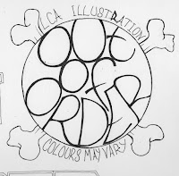
These are the first few things i drew out right quickish as i dint want to send too long on this at first. Tryed 3 different approaches to give myself some variety to play with and see which I liked best. Of course I choose the ones I had added some bones to.
I played around in photoshop adding the colour and effects to see what it could add to the final concept. I also thought about leaving it black and white and adding detail with dots and marks, this is a idea i'm going to work on at a later date.

Later I redrew the idea but this time I added flower petals and a skull creeped into it and ruined it as i drew it right in the way of where I needed to added the petals. Added a whole bunch of circles to the circles that has the lettering in to try give it the center of a sunflower look.
If I had spent more time on the design at this stage adding more dots to build up the shading to add some more depth to the image. This may have taken a few hours to achieve this but now looking at it it could definitely do with some detail.

Again got carried away in photoshop
I feel if I had left out the skull and just added the petals instead it would of made the overall look of the design more of a logo and less complicated. Along with the adding the shading better I feel i could of turned this into alot better design. So next time i will spend more time on the planning and development stages to better improve the final result.

No comments:
Post a Comment