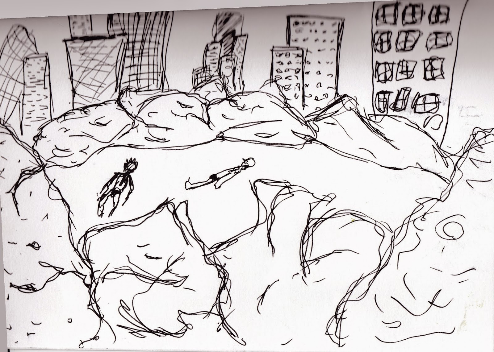
Here i have tried out some different composition lay outs to see if the changing arrangements of the different elements makes the image look different.
- Using just 3 elements Sunbather, A City sky line and Bushes.
- Too much space between object and the sunbather looks like he is floating in mid air.
- Sunbather and Buildings too big.
- Make the the buildings smaller so they appear in the distance and are part of the background.
- Sunbather needs sorting
- Really like the skyline on this it looks like its in the background and still holds its grand scale it would be.
- Sunbather happy but needs a purpose, happy will not cut it.
- Tried to add more bushes to give more of a city park feel but it just takes over the image.
- Skyline extended off the page does not work at all

- Only the sunbather lets this one down needs to be scaled down and put in a better place.
- i feel the balance is getting there with the bushes and skyline
- The space around the buildings works well


No comments:
Post a Comment