SunSET

SET of russian dolls
Tried adding some sort of political message as i find it hard to mention russia without try to point out any of they many human rights issues they have.
ways of adding the pussy riot style balaclava to the russian image.

Added bonus on developing these dolls i learnt how to draw roses which i have wanted to learn to draw for a long time just not had a reason to learn until now.
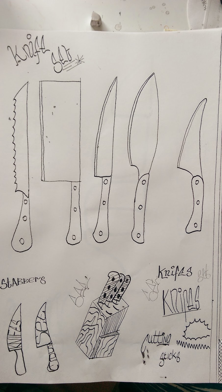
SET of Knifes
different knifes set out, many styles of kitchen and outdoors knifes to choose from.
With this one using the letters as a fill to see if you could see it was a knife.
Set Jelly
Playing with the word to see which one looks the best, trying different ways of writing it. I found that to make it look like jelly i needed to add "wobbly lines"( scientific name)
Wobbly lines added looks just like jelly.
Used a few different styles of font to see which one worked best in large scale. Even to see if in landscape it worked but i feel with the paper in portrait
Without "wobbly lines" added they look more like a cloud based font.Tried to do one in a basic russian font yo see if it worked but I feel the results where less of a im
pact then the jelly ones.
Need to add wobbly lines to give the wobble effect. Looking at many photos of jelly on the internet i then started to try and get the colour sheam right as that is a major part of jelly.
FINAL DESIGNS
If i was to produce this set of posters again i would not use there different types of medium i would do them all in the same, as the colours would all match a lot better and it would resemble a set alot more. i would also use either a coloured paper or paint a back ground colour that i would apply to all there as i feel that with the sunset image having colour all over it this then makes all the wight negative space on the other two stand out a lot more and makes the poster feel abit empty.
On the russian dolls poster i would make sure i mocked out the design a little better and tried a few more different ways in which the positions of the dolls are done. As i feel this lets the poster down, could of also added more to fill the negative up, which could also give more of a impact when you see the poster.
The jelly set poster i feel turner out the best as it is easy to understand and gets the meaning across well. The only thing that i would say lets it down is the finish as it looks too messy with the brush marks and application of paint been shody.


No comments:
Post a Comment