 |
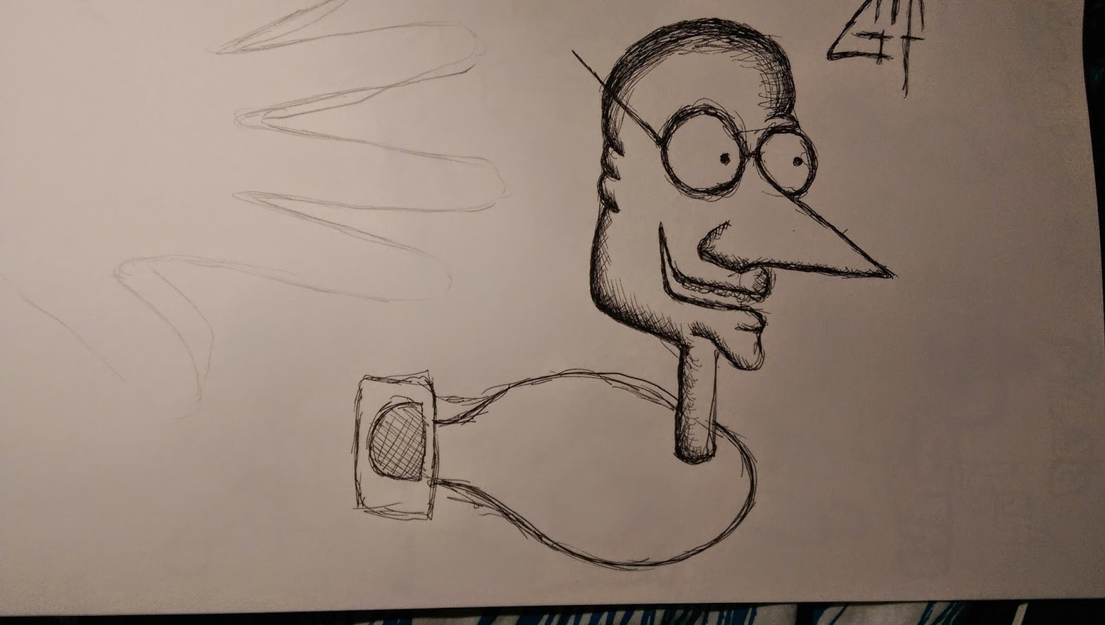
| "Danger Slug" this is going to be one of the shortest framed ones i'm doing as i just want the slug to go across the page like it is expanding and contracting as this is what slugs do. |
Tuesday, 24 February 2015
GIFS step 2
So from the many character designs i had to pick three and turn them into animated gifs using Photoshop. First a story boarded my ideas in roughs so i know what i was working with, how many frames I was going to use and some colours i could possibly use.
OUIL406 Studio Brief 1- I see faces- 60 characters
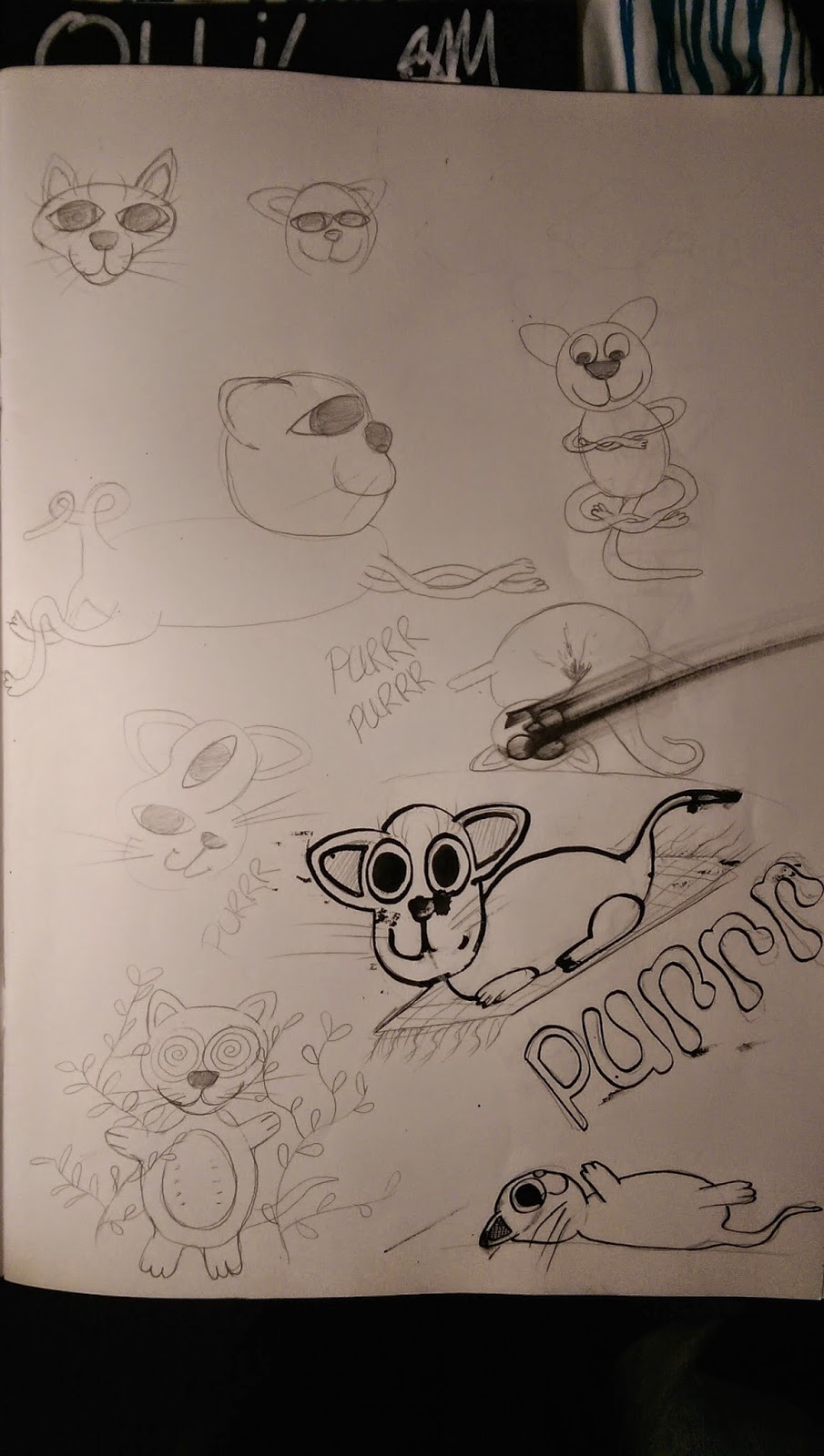
Here is all the drawings I did over the week to develop some characters for my gifs. I had real fun doing this as I find it very enjoyable to just sit and draw many characters. by giving myself a series of different headers that gave me some a subject to build a character from, but also just doodling seems to bring a lot more interesting shapes and dynamics to theses. Most of these have been done using a 0.8 fine liner, this way if i made a mistake i just had to work with it and try incorporate this into the design.
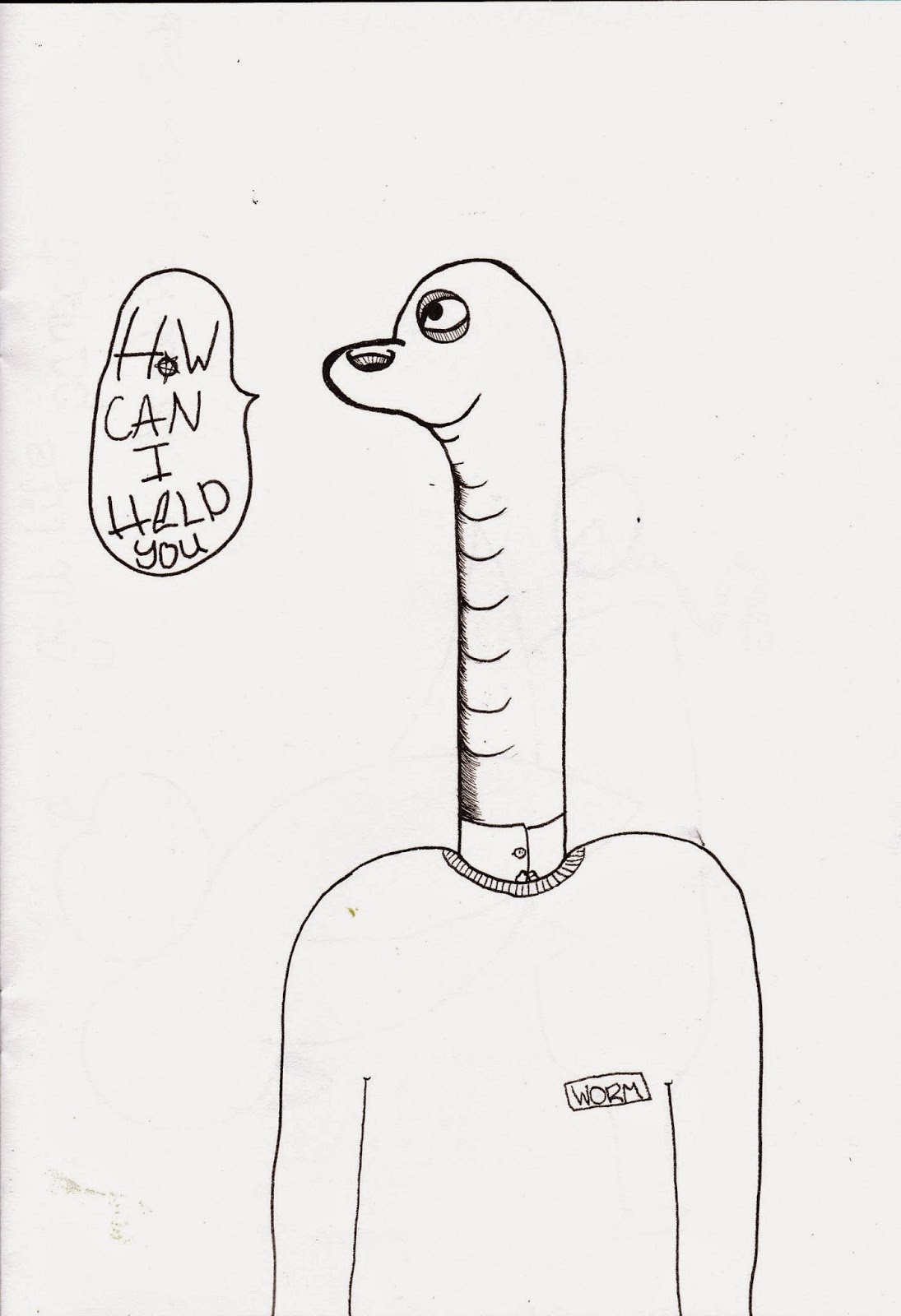
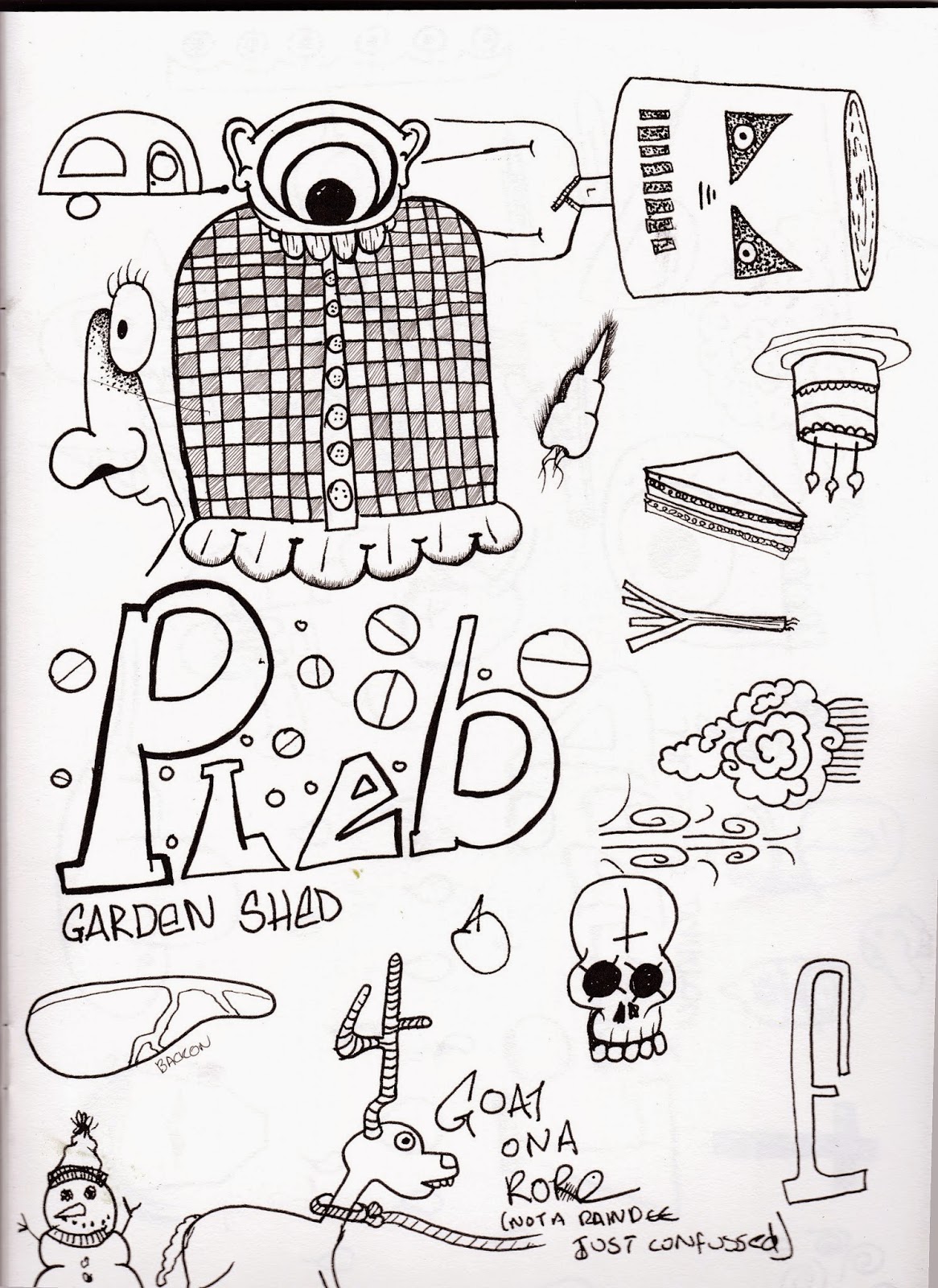
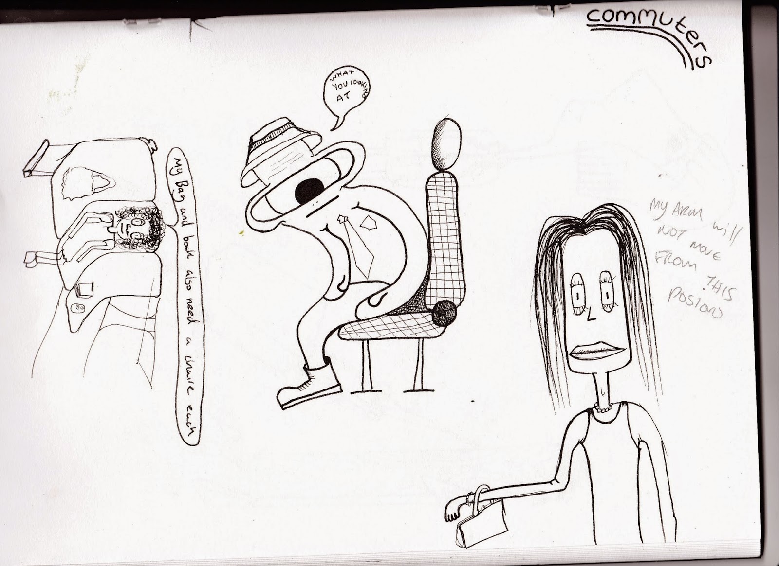
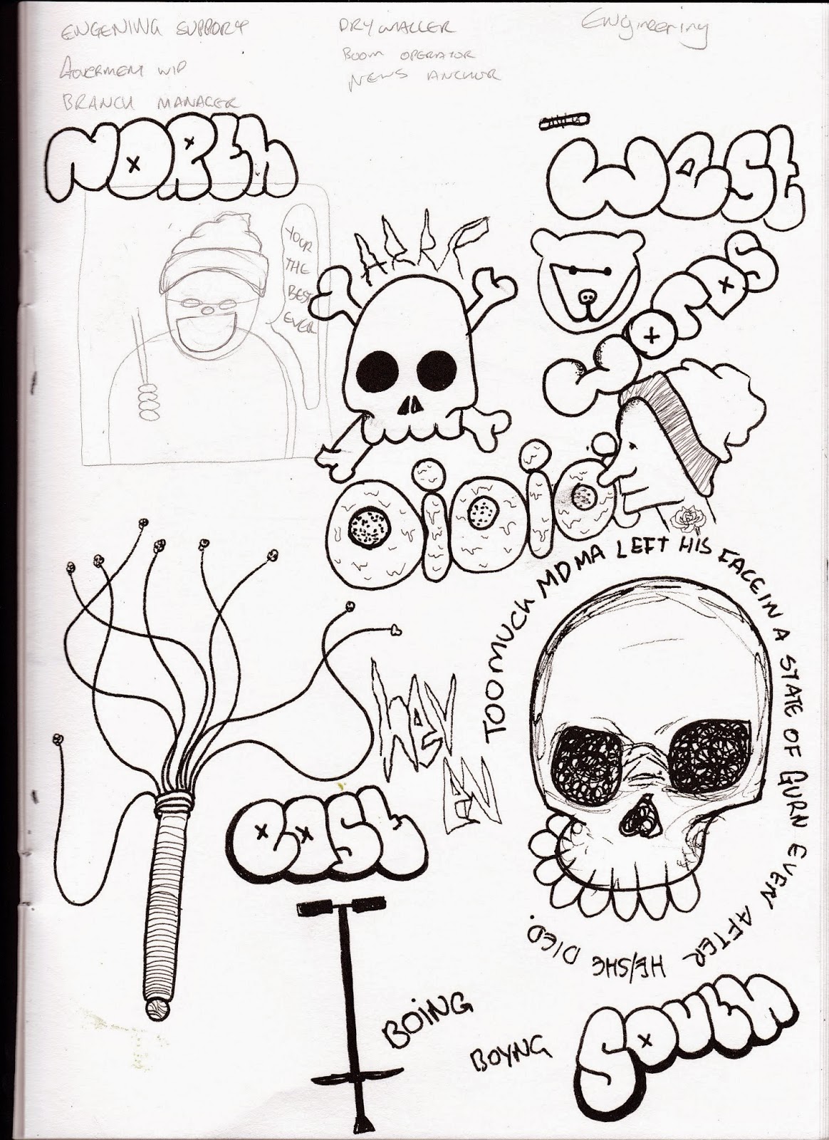
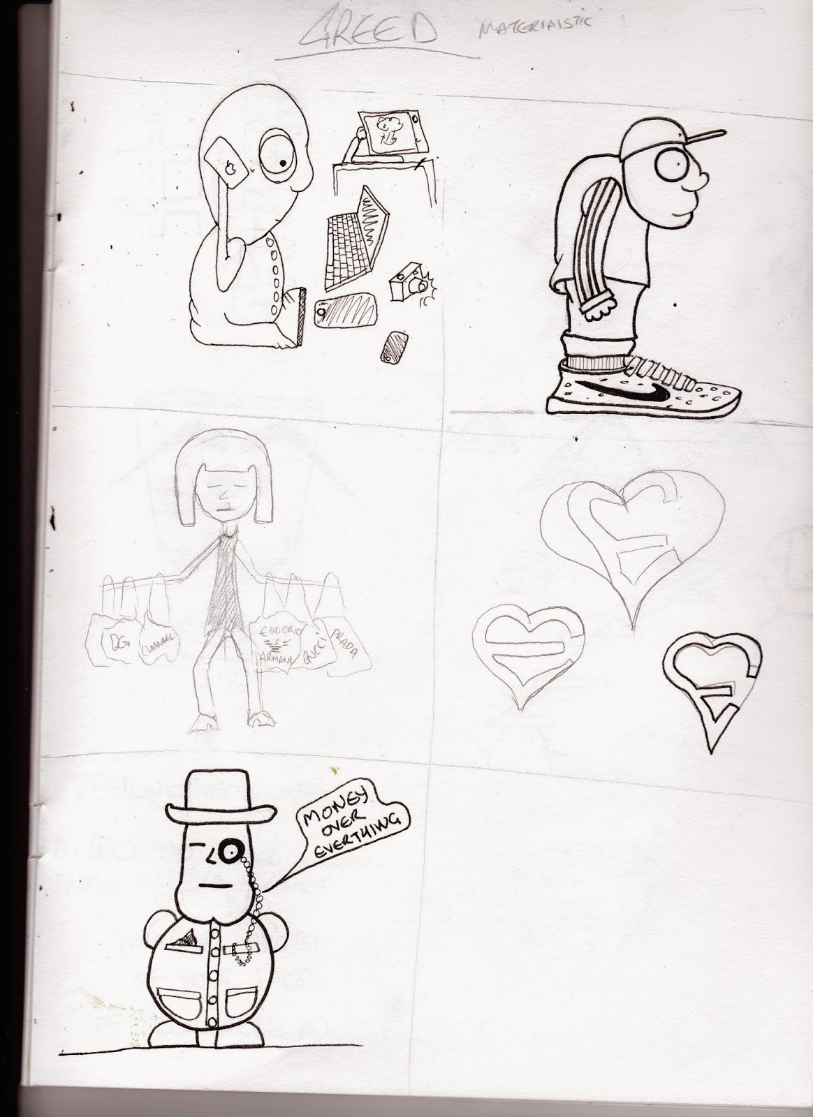
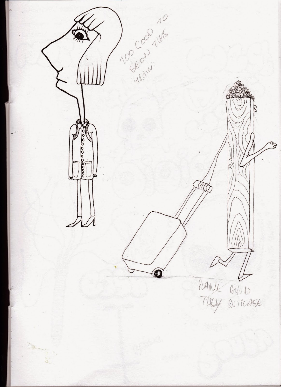
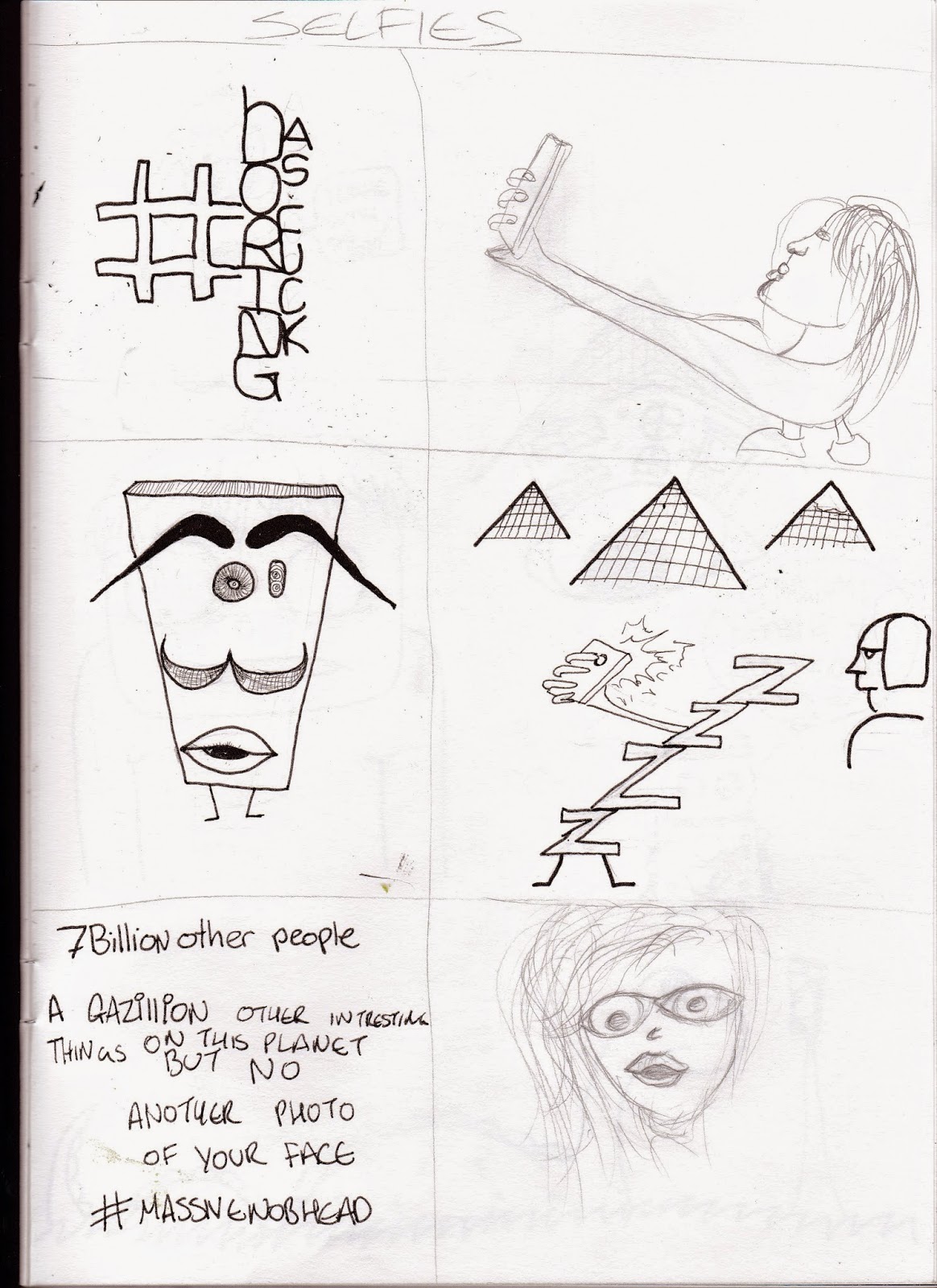
These where done in class when visiting professional john was here. The left hand side was done do random things been pick out of a hat and then we had to come up with a character for that. this was a good exercise as it made you just draw without thinking too much about what was been drawn all i had to do was get the two bits to work together. On the right hand side we handed our paper to the person sat next to us and they drew a series of random shapes then we had to find a character in that shape mainly by just adding a face seemed to work.
Tuesday, 17 February 2015
Illustrator
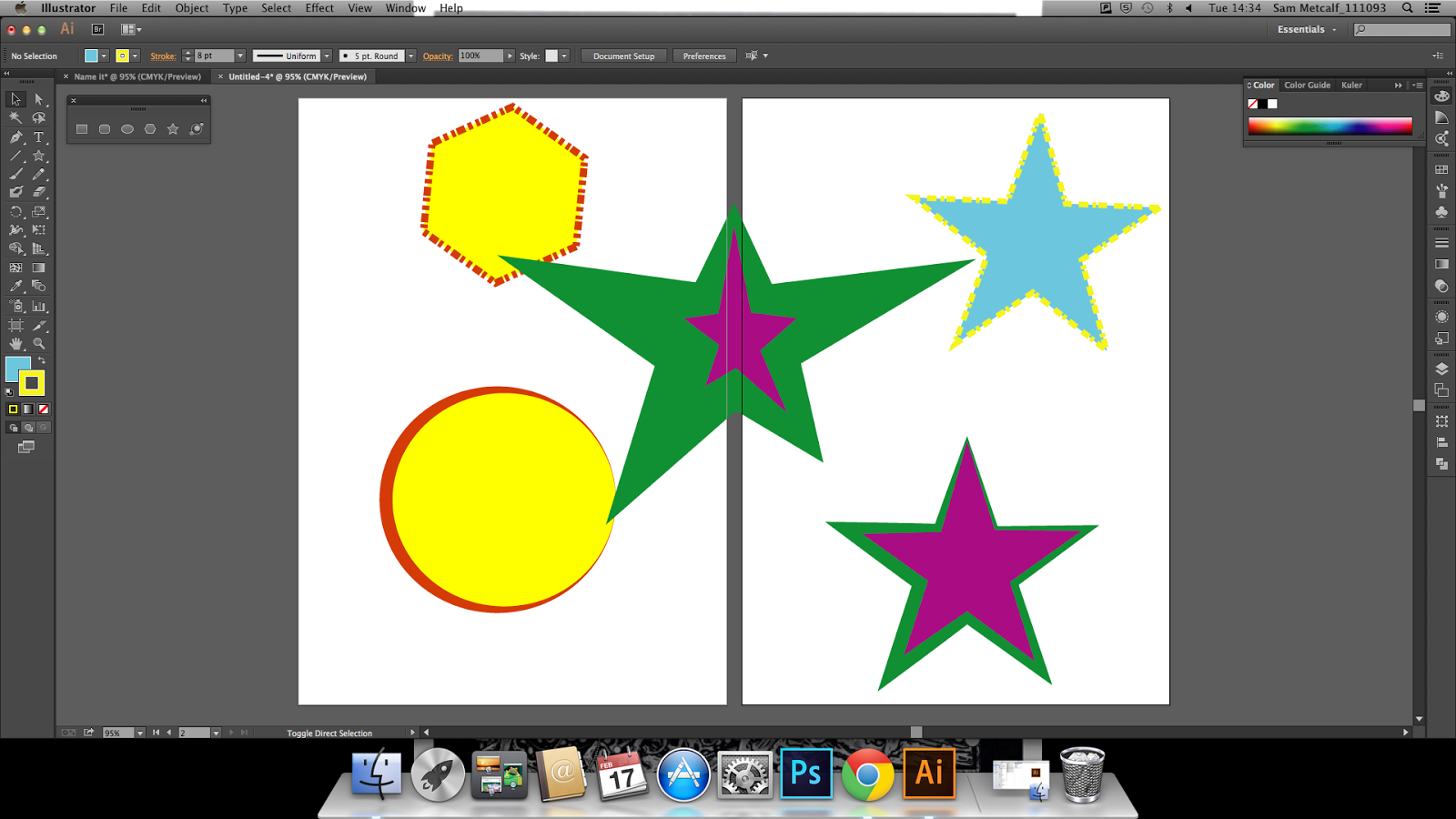 |
| Playing with the fill and stroke |
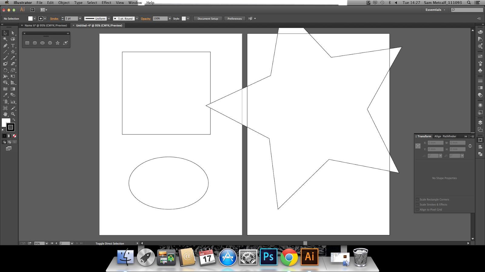 |
| Using the shape tool to make standard shapes |
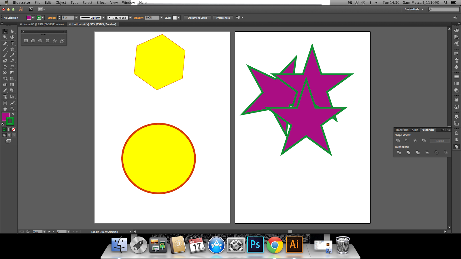 |
| Changing the fill and stroke colours on the tool bar fills the shape, and you can change this for both the fill and the stroke |
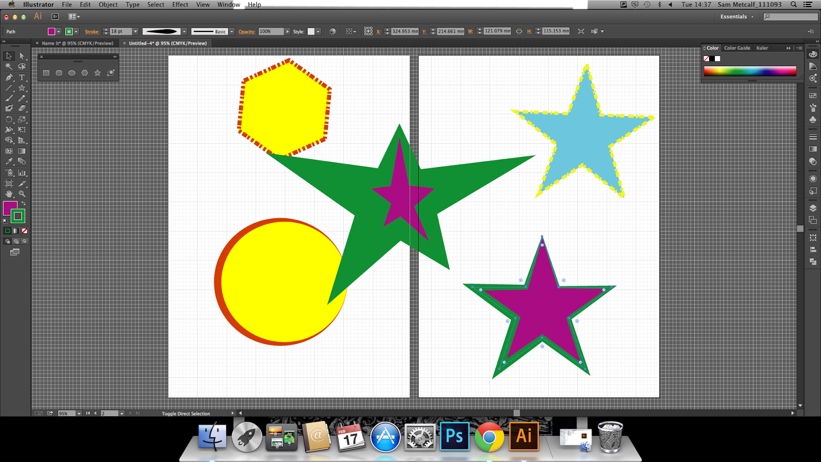 |
| Using snap to grid you can do technical stuff makes it presice. |
- Smart Guilds- help line things up (lods better the photoshop (little green things)
- Pahfinder tool -each step of the shape s shown and can be edited
- Allien tool to get shapes in order\
- Saving, export to change the formats to the normal formats to open in other programs
- Make sure artboards is ticked on
- PNG in reccomended keeps transparent clear.
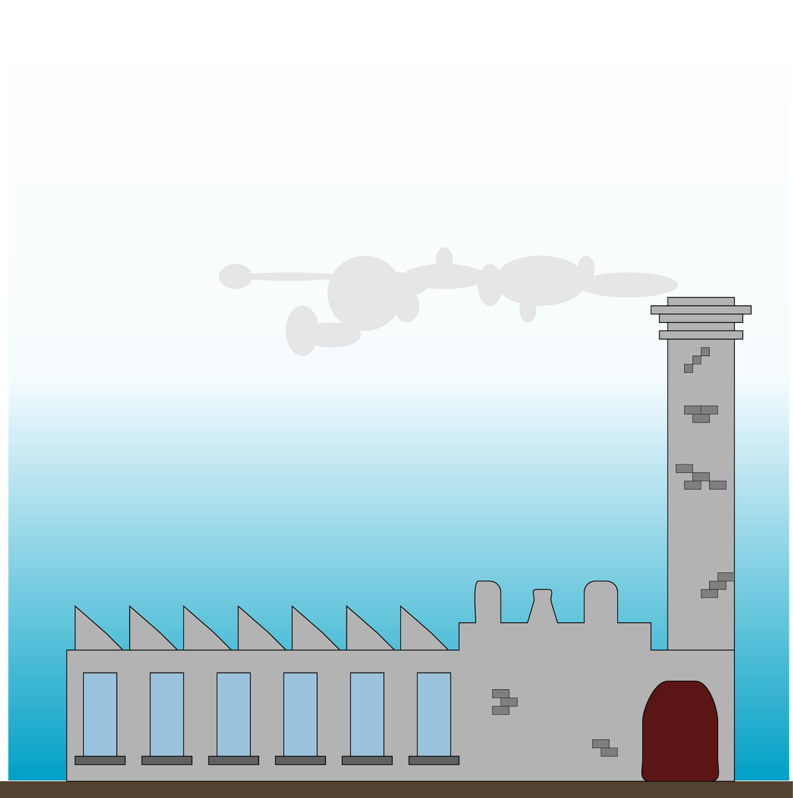 |
| Using my new found skills i made a mill with a draw bridge |
Gifs First attempt
Here are two gifs i have made. They are very basic but its the starting point. Hopfully going to improve these with backgrounds and maybe re draw them to get better quality of lines and better end result.
Added some back ground and im very happy with the result. took the images off google as when I tryed to take a phot of space with my phone the quality was not as good as the one i have used and the daisies I have planted in my garden have not drown yet but soon hopefully.
Wednesday, 11 February 2015
Composition task
Here i have tried out some different composition lay outs to see if the changing arrangements of the different elements makes the image look different.
- Using just 3 elements Sunbather, A City sky line and Bushes.
- Too much space between object and the sunbather looks like he is floating in mid air.
- Sunbather and Buildings too big.
- Make the the buildings smaller so they appear in the distance and are part of the background.
- Sunbather needs sorting
- Really like the skyline on this it looks like its in the background and still holds its grand scale it would be.
- Sunbather happy but needs a purpose, happy will not cut it.
- Tried to add more bushes to give more of a city park feel but it just takes over the image.
- Skyline extended off the page does not work at all
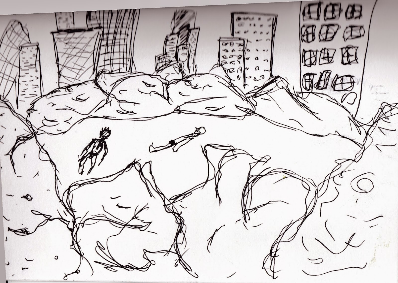
- Only the sunbather lets this one down needs to be scaled down and put in a better place.
- i feel the balance is getting there with the bushes and skyline
- The space around the buildings works well

A GIF for the blog.
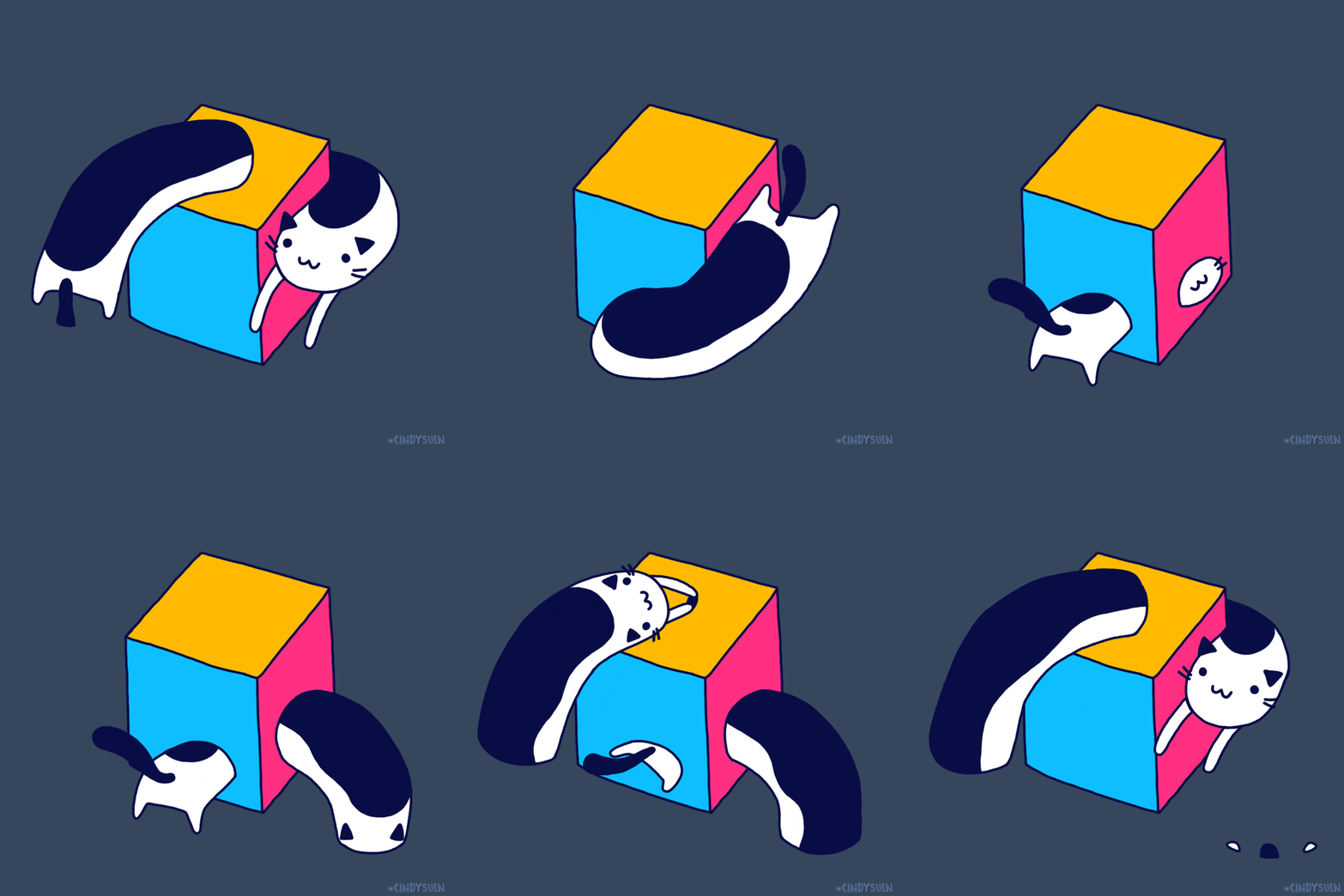
This Gif is done by Hong kong Illustrator Cindy Suen. I have picked this gif as it has given me a good idea for one of the gifs i have to make, and i like how its just a flying cat and a multi coloured box, nice and simple.Taken from the artist Tumblr page www.cindysuen.tumblr.com where threre are loads of amazing gifs to look at manly cats and pizza based.
This one is by Nicolas Ménard who is a Graphic Artist & Animation Director. I like his use of shape for the shoe,sock and trouser. these shape elements are static so would help when animating the hands and lace as the rest don't need altering at all. How the laces have some spring in them with. this would be a great invention as mine just droop down and always come undone but with added spring may help them stay lock tight.
This guy reading his book looks like he is wrapped up warm and the little vibration makes him look like he is shivering with cold. How he only uses a out line to show bits that are overlapping on the coat and book.
Subscribe to:
Comments (Atom)


