Wednesday, 20 January 2016

OUIL504 End of Module Self Evaluation

Sam Metcalf  
Leeds College of Art
BA (Hons) ILLUSTRATION Level 05
OUIL504 About
End of Module Self Evaluation


About a Author brief has been a unit in which I have learnt the most about my practise and myself. Whilst doing this unit I have picked up various new skills and built on ones I have been new to in the past. One of the main areas I have seen myself build on and enjoy is in my development work as I now enjoy building on a idea instead of just going with the first one that pops into my head. In doing this I have leant and starting using new methods and materials to add to my work. The one I have most enjoyed most is using charcoal to aid in my development and deliver fantastic results in my final development stages of my images. This combined with my on-going understand of how Photoshop can help in my designs has been a successful partnership for me and will defiantly be keeping theses in my tool kit to be used again.
I have also used new software on this project, which is After Effect. I have been though a range of emotions whilst learning to use it, the main reason I struggled at first with this software was my ability to take notes in taught sessions where they showed us how to use it. But once I had been shown with a bit of one to one I started to see how it worked and now see how I could use it later on in my practise.  Also how easy it can be to use After Effects with Photoshop, Photoshop can be a real help in after effects in the area of setting up your different layers of each of the parts of a animation. This is something I really want o explore more the fact I can draw something on paper or my sketch book  and then  have it scanned into my computer and tidied up in Photoshop then simply export it to After Effects where it can be bought to life.
I would say that even though this project has not been my best I have secretly enjoyed it now I look back on it. The fact I have built up on my skills and brought new ways to help me develop my work I cant help but feel I’m going to have to winging and moan and start seeing the improvements these new skills are bringing to my work. Saying that there are still some areas I need to Improve on dramatically mainly my ability to use the time properly and start to plan out each stage of my process.  Even though I have been going through some though health problems I feel I have wasted loads of time at the beginning and the middle of this project. So I need to start taking the time I’m given very seriously and make myself balance the workload out in a way that I get things done  and simple just start planning an not try to wing it as this has a massive impact on my final product. This can too be said about the way in which I do approach the research and the amount I do. As with everything I do if it involves having to read I tend to shy away from it but I need to look at other areas I do the research, such as watching things on the subject or listening to podcast, talks or even radio debates. The only outcome of avoiding the research is ill informed final results which if I’m not careful could be quite embarrassing and could end up wasting even more time having to start over.

So from now on I need to start to plan out within the time I have how I’m going to work and the time scale in which I have to do the task I need to do to complete the project. When I’m given a project start right away with little but easy to manage times to research the subject to better help my knowledge of what I’m working on, which in turn will help me achieve a better end result. Also give myself time to explore and experiment with the ideas I have which could mean doing test prints seeing if I’m happy with outcome and if I need to go back and try a new way to do it.

Other artist work

So i have looked around at the artist who have a issue or two with the world and try to show this in they art. One of the main people who Does this is Shepard Fairey and also whilst i was on with this project for This Changes Everything Shepard released a poster for this very book which was great. Here is his version of the poster. Its a 6 colour poster that uses very bold imergy and text to get you looking, the fact he has set the world on fire makes you want to know why it is and my get you to research the book. The red boarder that leads your eye into the center of the poster then to the flames helps take you to the text so you almost read it without meaning to as your eye just ends up there. . I don't feel its his best work but as far as representing the book i think it does a great job, adn the bold use of colour makes it a nice piece of eye candy to look at.


e"This Changes Everything"


David Brooks

This  CONFUSED POLAR BEAR / CACTUS by David Brooks. I really like this image because it illustrates climate change so well and the message is so clear with it. Also the way in which he has produced the work is in a similar way i'm starting to work, with doing the outline and textures pen and ink,  then taking it into the digital world. I think he has used illustrator in this as it says it's a vector.
I like how the main subjects are the ones with bold outline and black marks for texture as it makes it stand out from the digital background, the contrast between them works really well.  Also the suttle light blue out line that links the bear and cactus together helps keep your eye on the subjects as it highlights them.
illustration of Polar bear perplexed by prickly pear cactus growing up through the ice. Global warming climate change.


Tuesday, 19 January 2016

Playlist for working with added umphhhh

Here is some of the music I have been listening to on this project, plenty more was listen to but i have not added then to this playlist and i think you get the picture of what i listen to most of the time when i'm working of my imagery.


Monday, 18 January 2016

Sting

Right so the sting i have put off for far too long as i'm not comfortable with after effects at all, but I can't put it off any longer. After speaking to my tutor I have been told to just keep it simple and animate my poster so thats what im going to attempt.
This is the design i'm going to work with as i feel it has the elements to show what i'm try to communicate Climate Change. The only change may be the colour as i think i'm going to print this using blue.

Screen printed poster used for my sting. 


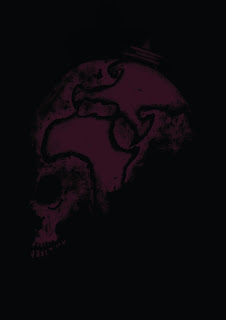
So  to start off with opened my image of the skull earth with oil rig in Photoshop and split the image into the different elements I wanted to move on my sting and put them into they own layers. Then i exported the PSD file from photoshop and opened it up in After Effects. Here i began to work out where i wanted the movement to happen and added the Anchor points that would enable me to do this. As I felt very unsure at my ability to use After Effects and animated using it this been the first time to do so,  I just kept it very very simple and decided that my animation could be very basic and only include two main movements and music. Using the position part of the timeline i added the key frame where my animation was going to start, then adding another point i moved my image into the center of the screen creating a path for the image to move up. Like in Illustrator using the pen tool the line i had just created could have points added to in so i could bend the line to make it look like the earth was swooping into view. Them i just did the same thing with the oilrig and made it appear out of the top of the skull so it looked like a massive oil rig drilling the whole world. 
For the music i was gong to try create my own jingle using Garage Band but I decided with the time i had left this would be a rushed job and would probably ruin the animation. So by typing royalty free music into google i found a website that had loads of tunes made ready to use, so after listening to a bunch of them i decided on the one i used and added it to After Effects where i cut it down to 15 seconds. The reason the one used was used is because at around 7 seconds it sounds like another piano starts up and i feel this helped at the correct point for the oilrig to appear. 


This changes everything from Sam Metcalf on Vimeo.


Sunday, 10 January 2016

Storyboarding studio brief2?

Storyboard workshop

ouil504


Story boarding. 

Over veiw of what storyboarding is and what they are.
How storyboarding works with 504 and some possibility  how story boarding works with in illustration. 

A sequence of pictures created by a production illustrator to communicate the desired general visual appearance on camera of a scene or movie 

A form of shooting script common for animated films for many years and how now usually used for commercials even live action ones. 

Story boarding telling a narrative, it's our job to express that!

The process of visual thinking and planning allows group of people to brainstorm together, placing their ideas on storyboards get and then arranging the storyboards on the storyboards. 

Rough way of getting things down, any frames in shot, not refined, GET THE IDEAS DOWN. 

Basic kind of for of story boarding is basic information and basic storyboarding. 

* sketch book, want to see all the ideas, the hard ones the easy one the lot! 
A series of rough sketches that show the rough the actions what's in the frame and what's not, the images that you think maybe would look good, all the question you ask get in your sketch book. 


Hell boy story board. Storyboarding can be a refined and complicated work for an illustrator it's not always these rough and simple drawings sometimes it requires a more detailed shot.

A place were you can look at your pages and edit them. Remove frames add frames. 

* Watch Cameron Stewart. Illustrator and story board artists for dark night.
* Whiteout storyboards 

4 key toes of movement

Positional 
Pan
Track
Zoom 

Studio task

Select one image from your 5,  place the image into the centre fram, fram number 9. Then 3 different ways how the image leaves so the last frame is blank. 
Things to consider simplify, edit, remove, add


Some Problems within the story boards we had created. Things to consider,

Limitation to get out the idea with in 9 frames 
Working with one image
Having the image centred, it was hard to creat a story with in frames. 
Sometimes had to work backwards due to the last frame was blank. 
Hard to create the story because you all ready have the end of the story with the blank frame. 
The aim with story boarding is to document them as an idea and when completed look through them and see what works and what dosnt how to simplify the story board that works with your level. And if you can't do it don't attempt it...simple.to Plan your 15 seconds and how your going to work with after effects.

Screen grab- can be used to demonstrate a program a particular problem a user might be having or generally when computer output needs to be shown to others. Needed to used part of the development. You can coming ate what it is they are looking for by sketch book development. Screen dumps, story boarding, roughs thumbnails, notes. To evidence the good ideas that you can't do. 

Working for screen. Story board templates are the diomention of the screens we use like phones TVs